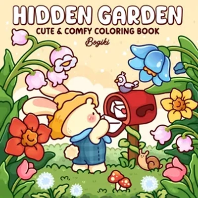
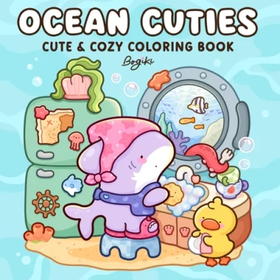
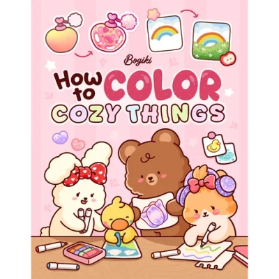
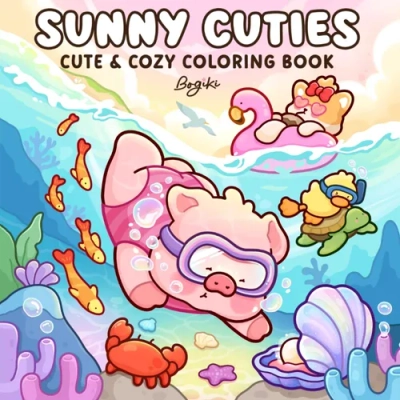
Welcome to Bogiki world

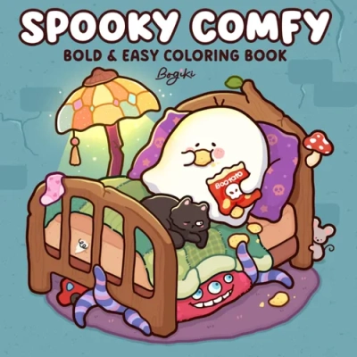
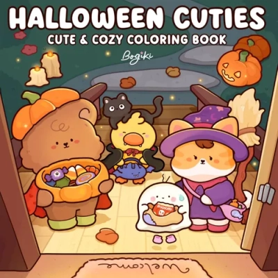
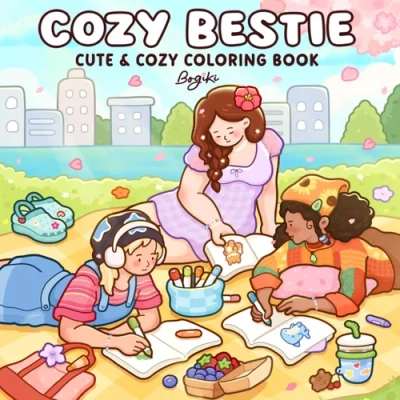
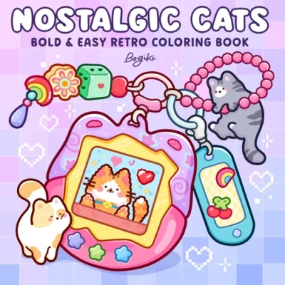
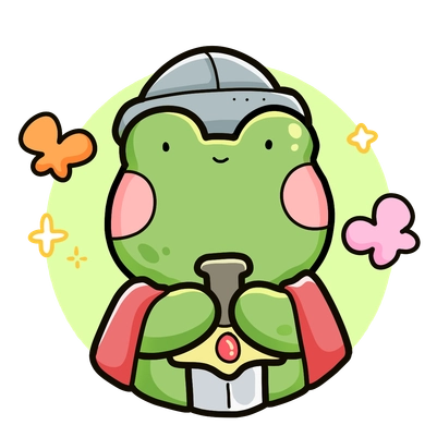
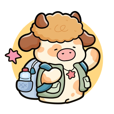
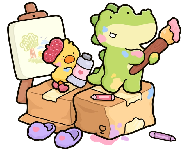
What started with a love for coloring and cozy moments is growing into Bogiki - a creative world of hand-drawn books made for relaxation, gentle self-connection, and everyday joy. Through warm, approachable illustrations, we hope to connect a global community through the simple joy of coloring.


You have questions? We're here to help.


Both beginners and experts can enjoy books.


Bring peace and everyday wellness to your mind.


Every design is created by skilled human artists.


Trusted and loved by coloring fans worldwide.
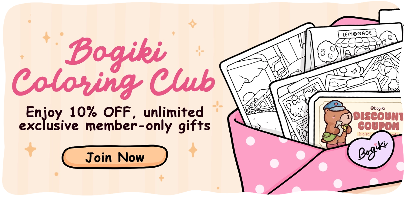
Enjoy 10% OFF on all digital coloring books.
Explore a special birthday gift with an exclusive coloring card and a 15% OFF coupon.
3 exclusive coloring pages, never released in commercial books.
1 Creative Challenge
1 Surprise random gift (Bookmark, Postcard, or Mood Tracker)
Access a growing collection of helpful resources for your creative journey.
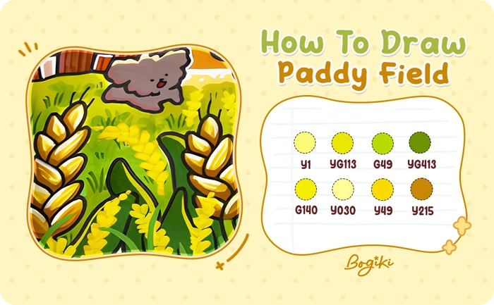
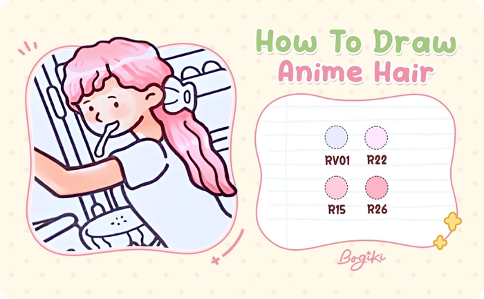
Diverse coloring guides and step-by-step coloring tips.
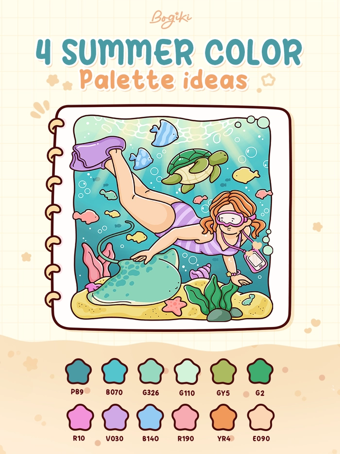
Ready-to-use color palettes and curated artistic inspiration.
Discover and experience our newest books before everyone else.
8 free coloring pages available for download from all books.
Receive exclusive newsletters delivered straight to your inbox.
Sneak peeks of unreleased sketches and behind-the-scenes moments.
Direct artist updates, upcoming project news, and community stories.
Enjoy 10% OFF on all digital coloring books.
Explore a special birthday gift with an exclusive coloring card and a 15% OFF coupon.
Enter your email to get our special. Gift straight to your inbox.

Studio@Bogiki.com
Studio@Bogiki.com