


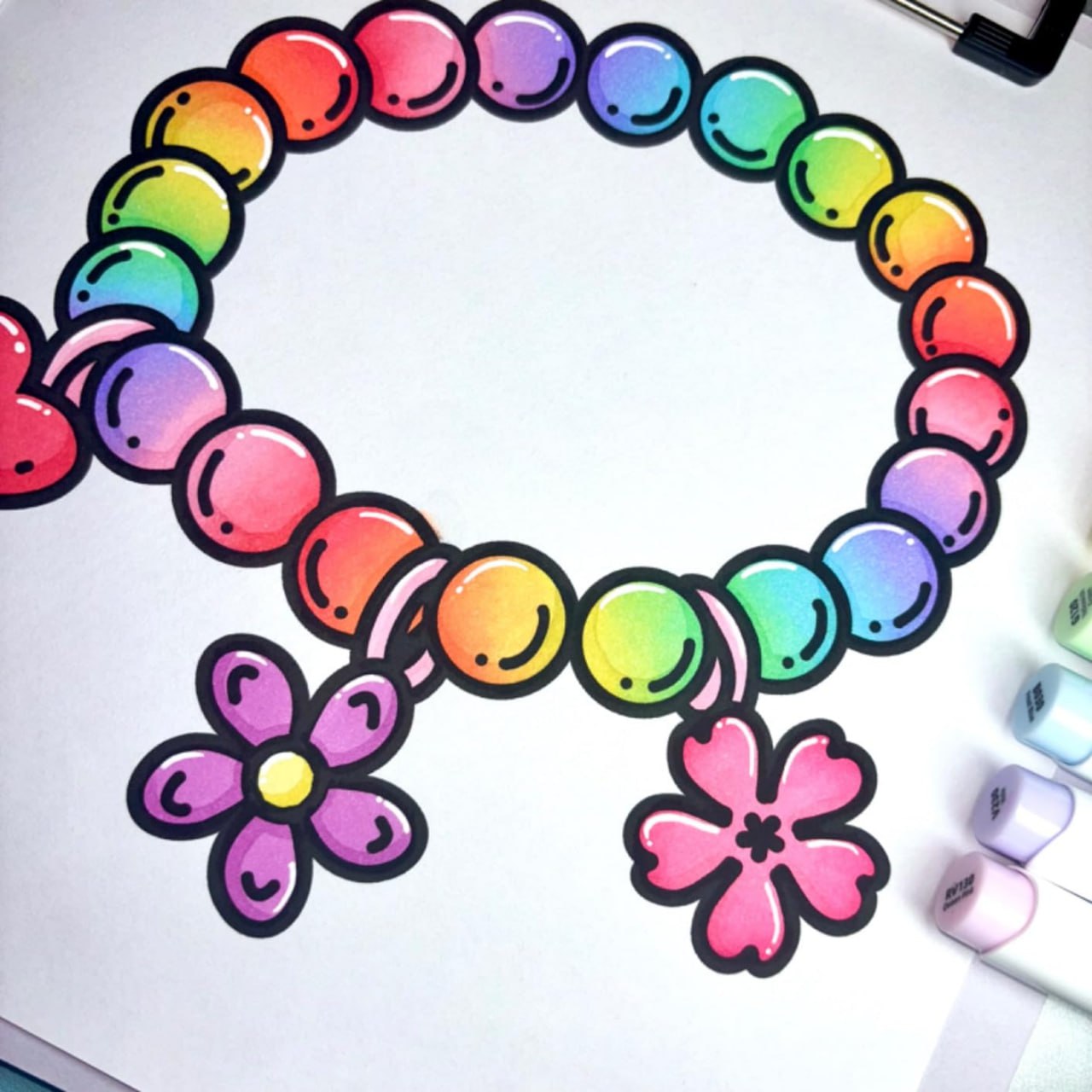
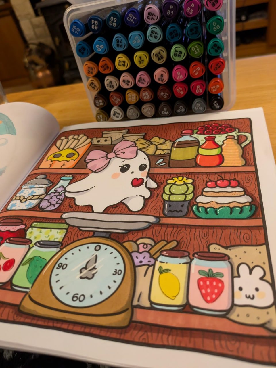
Both beginners and experts can enjoy books.

Prevents bleed-through and protects every design.

Every design is created by skilled human artists.

Trusted and loved by coloring fans worldwide.
You have questions? We're here to help.
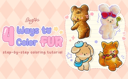
Learning how to draw fur is less about drawing every tiny hair and more about understanding softness, texture, and gentle layering. In this how to draw fur with markers step-by-step tutorial, you’ll explore calm, beginner-friendly ways to create fur texture drawing for cute animals. By following the illustrated steps closely, you’ll learn how to draw animal fur that feels warm, fluffy, and naturally cozy without pressure or overthinking.
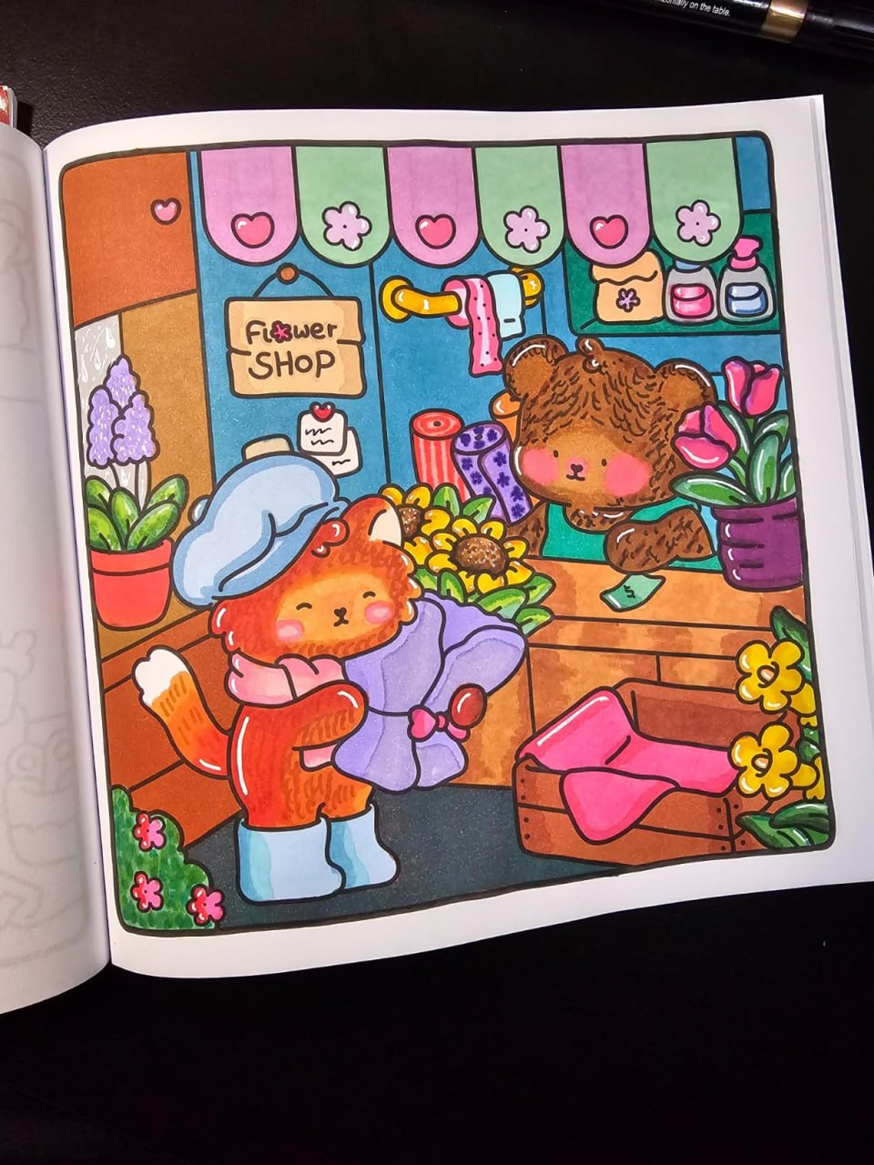
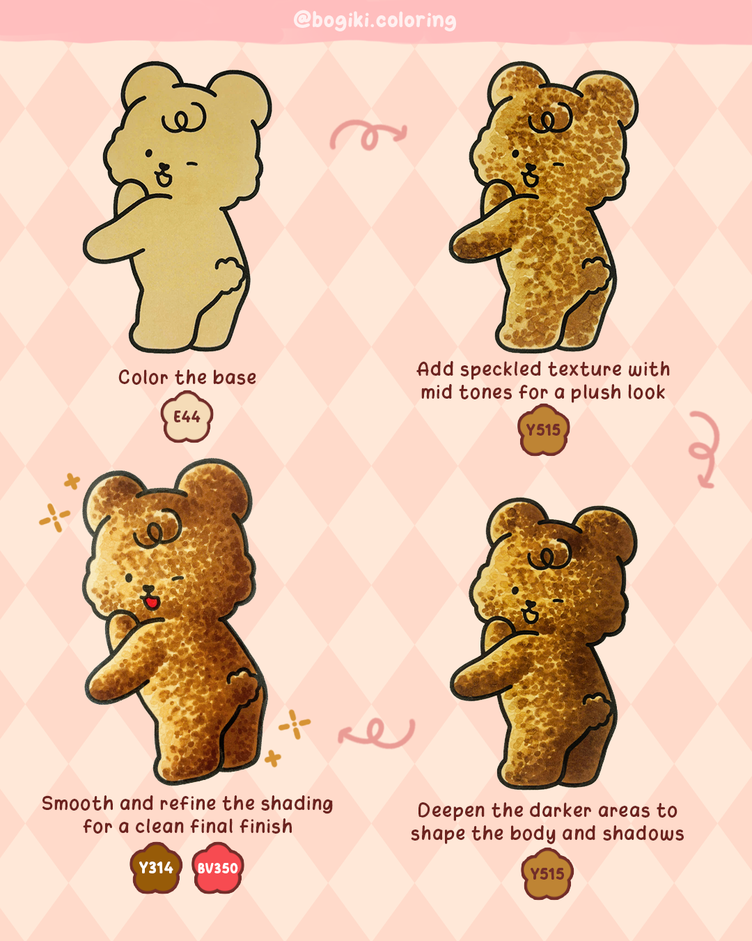
Bear fur often feels comforting because it looks plush, rounded, and slightly uneven, like a favorite stuffed toy. In this method, you’ll focus on how to draw bear fur using speckled textures and gentle layering rather than sharp strokes. The goal is to create a soft, cozy surface where the fur feels thick but calm, making it perfect for beginner-friendly fur texture drawing and relaxed coloring sessions.
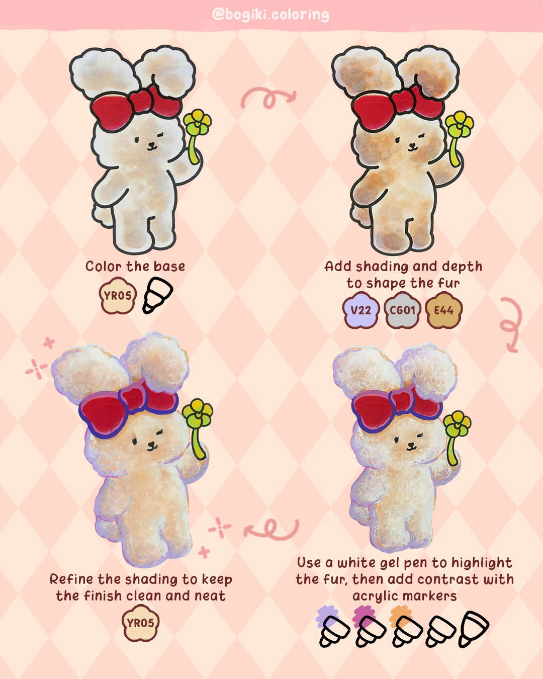
Rabbit fur feels light, airy, and delicate, often appearing almost cloud-like. This method demonstrates how to create fluffy fur by emphasizing smooth shading and soft highlights, rather than relying on strong texture. It’s especially helpful for how to draw rabbit fur and characters that need to feel gentle, calm, and comforting, where softness matters more than detail.
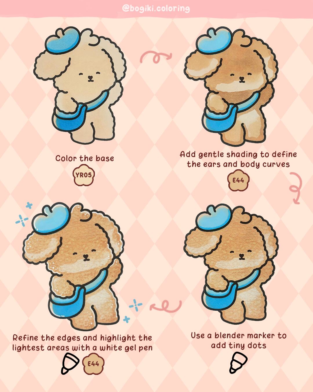
Dog fur often sits between plush and smooth, requiring just enough texture to define form without overwhelming the surface. This method focuses on how to draw dog fur by shaping gentle curves and keeping textures subtle. It’s ideal for how to draw fur easy, especially when you want a clean, cozy look that feels calm and approachable.
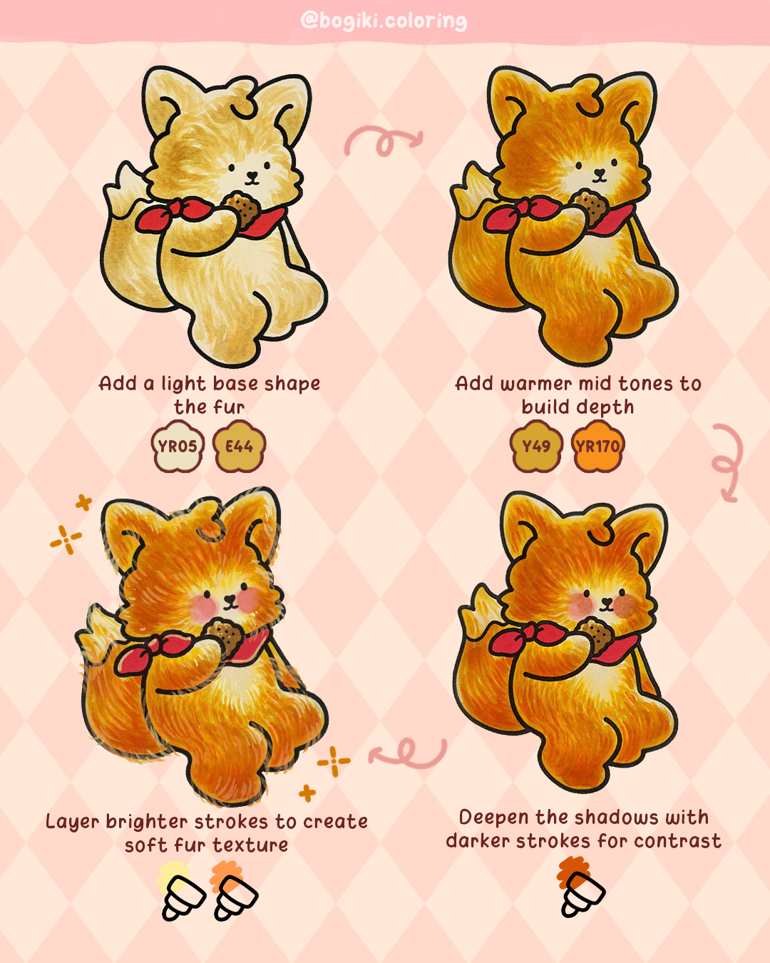
Fox fur often feels lively and expressive, with visible movement and warmth. This method explores how to draw fox fur by layering strokes that follow the natural flow of the body. It’s perfect for adding personality while still keeping the fur cozy and balanced rather than overly detailed.
How to draw fur becomes more meaningful when it’s part of a quiet, comforting creative rhythm. If you’d like to continue exploring plush textures and gentle personalities, 4 ways to color Fluffy Quilt friends offers deeper insight into soft, character-driven fur styles, helping you understand how texture and emotion work together naturally.
For extended practice, Fluffy quilt coloring book introduces a wide variety of adorable Fluffy Quilt characters placed in diverse, cozy scenes, giving you plenty of space to apply fur techniques and experiment creatively.
If you enjoy characters that feel close, warm, and emotionally comforting, Cuddle buddies coloring book offer gentle companions and intimate moments designed for slow coloring and soft fur layering. These are a few books where you can easily and enjoyably apply the fur drawing techniques from this tutorial, allowing practice to feel natural, relaxed, and genuinely fun.
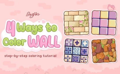
Walls are often seen as simple backgrounds, but in relaxing coloring books, a wall drawing becomes a quiet storyteller. In this guide, we’ll explore 4 cute wall drawing ideas inspired by cozy coloring illustrations. Each idea follows a clear how-to-draw tutorial step by step, making it perfect for beginners and anyone looking for easy wall drawing, easy techniques for relaxing coloring books.
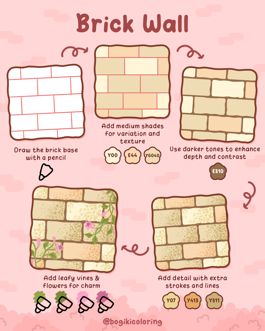
A brick wall drawing is a classic choice for cozy interiors, cafés, and warm storybook scenes. Instead of sharp lines, this style focuses on soft edges and gentle color variation, making it ideal for relaxing coloring. This approach works beautifully if you’re learning how to draw a brick wall easily while keeping the drawing calm and inviting.
Step-by-step: How to Draw a Brick Wall
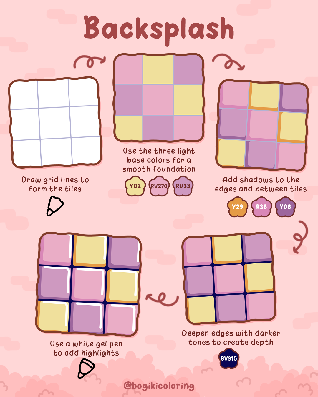
Backsplash-style tiles bring a playful rhythm to a scene. With rounded edges and pastel colors, this wall drawing idea feels cheerful and relaxing—perfect for kitchens, cafés, or cozy rooms. It’s also a gentle way to practice how to draw a wall easily using grids and color harmony.
Step-by-step: How to Draw a Tile Wall
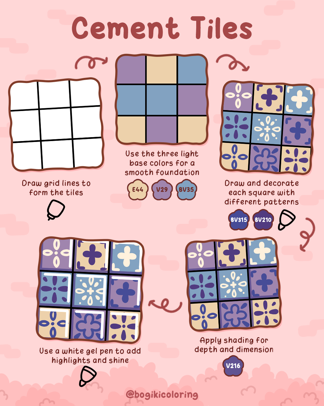
Cement tiles bring gentle patterns and symmetry into coloring books. This wall drawing idea is perfect if you enjoy decorative details but still want a relaxing pace. It’s also ideal for those learning how to draw tutorials step by step without overwhelming complexity.
Step-by-step: How to Draw Cement Tile Walls
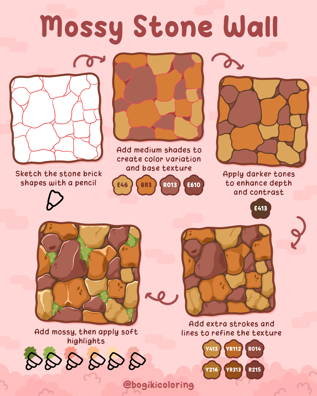
A stone wall drawing brings nature into cozy scenes. With irregular rock shapes and soft moss details, this style is perfect for storybook gardens and outdoor illustrations. If you’re curious about how to draw stone walls or how to draw a rock wall, this approach keeps things approachable and relaxing.
Step-by-step: How to Draw a Stone Wall
Wall drawings act as grounding elements in illustrations.
If you’re exploring wall drawing tutorial techniques or looking for fresh wall drawing ideas, start with these textures and allow yourself to slow down. You can even combine wall elements with natural surfaces such as warm wood to create richer backgrounds, similar to the gentle techniques shared in wood drawing guides on creating warm and natural wood drawings.
These calming wall textures pair beautifully with cozy-themed coloring books designed for mindful relaxation. Scenes like those found in hygge corner coloring book invite you into soft, intimate spaces where walls, corners, and textures work together to create comfort. Likewise, nook coloring book show how thoughtfully drawn walls help frame small, quiet moments, perfect for slow coloring and peaceful storytelling. Pick up your coloring tools, take your time, and let each wall come alive, one gentle stroke at a time, turning simple spaces into places of calm, warmth, and imagination.
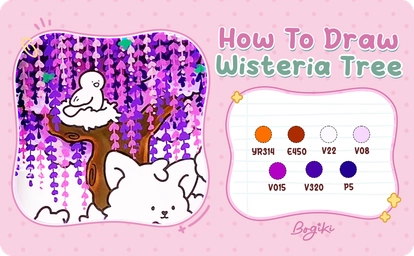
Learning how to draw a wisteria tree can be a wonderfully calming and creative experience. In this step-by-step guide, you’ll explore gentle techniques to color a dreamy wisteria tree with soft purples, flowing blossoms, and delicate shadows. From shaping the tree trunk to layering cascading flowers, this tutorial will help you create a graceful wisteria tree drawing that feels light, romantic, and cozy—perfect for adult coloring books and mindful art moments.
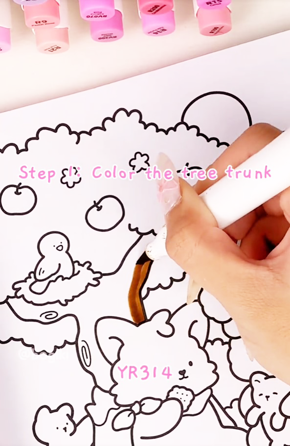
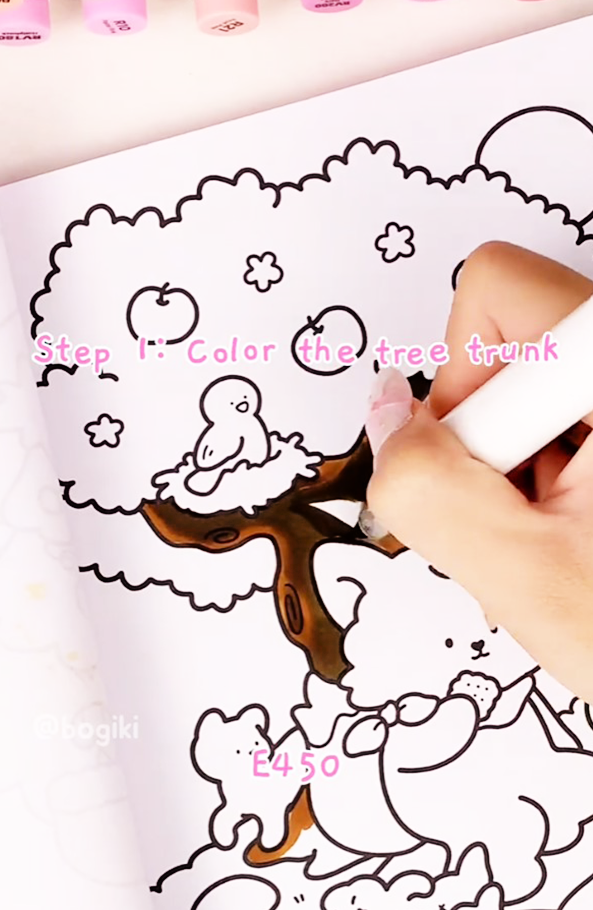
Begin your wisteria tree by coloring the trunk. Use the warm brown marker (YR314) as the base color, gently filling the trunk and main branches. Then, add depth by applying the darker brown (E450) to shaded areas and rough textures.
Focus on uneven strokes and small variations in pressure to suggest the natural grooves and rugged surface of a real tree. This step builds a strong foundation and helps your drawing feel organic, even if you’re practicing how to draw a tree for the first time.
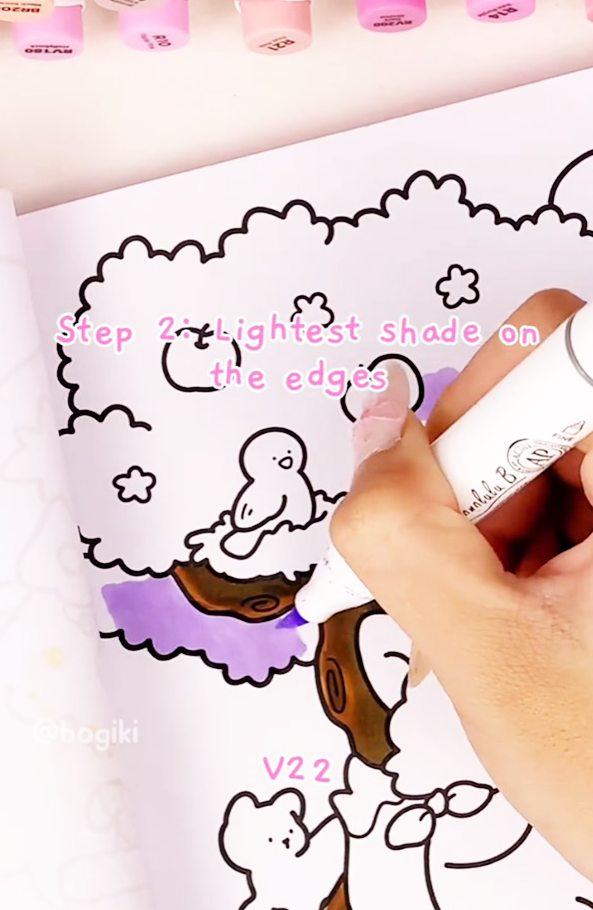
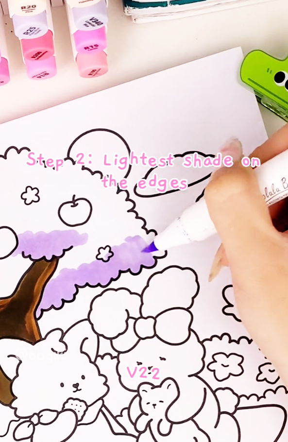
Next, move to the foliage area. Use the light purple marker (V22) to lay down a soft base layer beneath the tree canopy. This gentle tone sets the mood for a dreamy, romantic wisteria and helps later layers blend smoothly.
Think of this step as creating a misty background for your blossoms. Soft pressure and even strokes will keep the base light and airy—an essential technique when learning how to draw a tree step by step for coloring books.
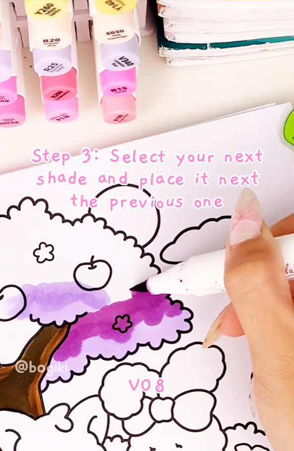
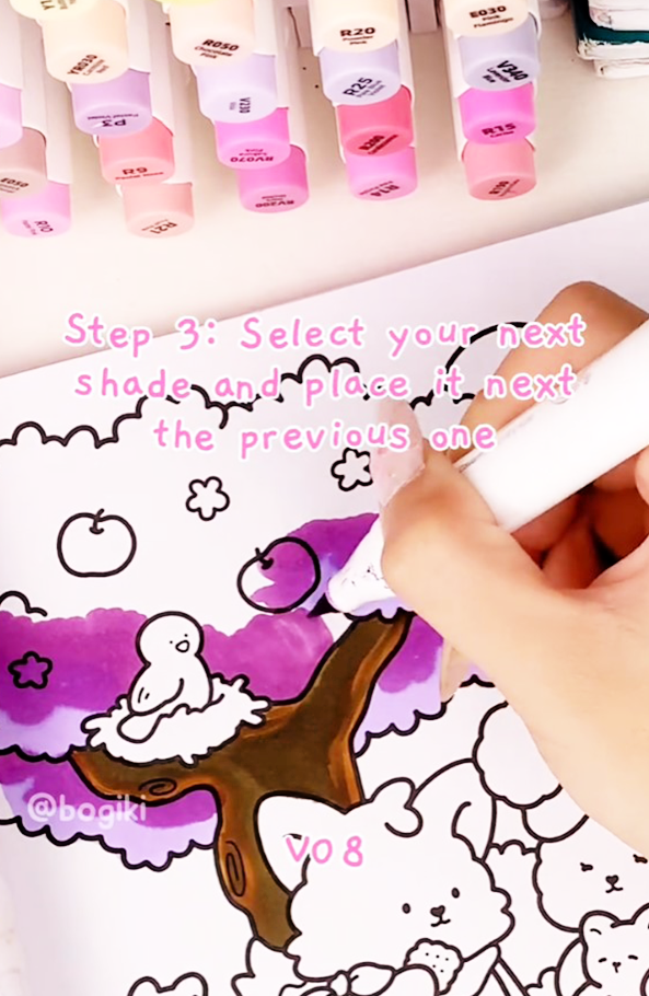
Now, gradually introduce a slightly darker purple (V08) and blend it upward over the base layer. Work slowly, letting the colors melt into each other. This transition creates the illusion of volume and depth within the tree canopy. Smooth blending is key here. By gently layering color, your wisteria tree drawing begins to feel soft and dimensional rather than flat.
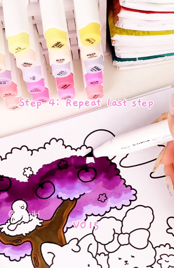
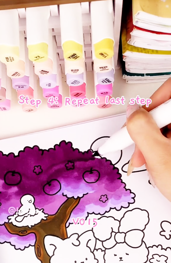
Continue building richness by applying (V015), a deeper purple, across the top areas of the tree. This layer brings harmony to the overall shape and enhances contrast between light and shadow.
Keep your strokes loose and flowing. The goal is not perfection, but softness—one of the most important principles when exploring how to draw a tree in a cozy, expressive style.
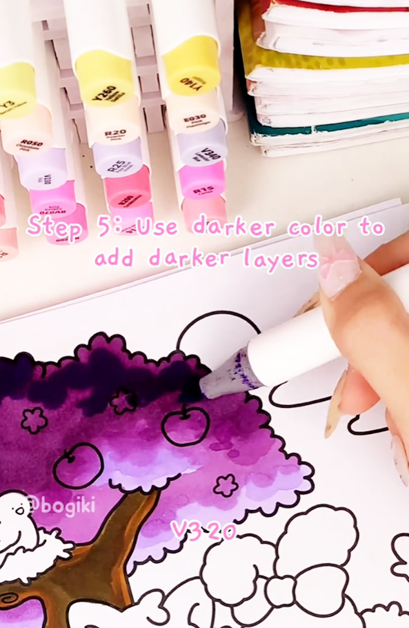
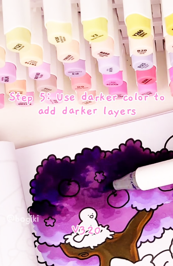
Use (V320), a dark purple marker, to create deeper shadows within the foliage. Focus on areas where leaves overlap or where light would naturally be blocked.
Adjust the direction of your shading carefully to suggest a light source. These darker accents give your tree structure and make the blossoms feel lush and full, elevating your drawing beyond a simple outline.
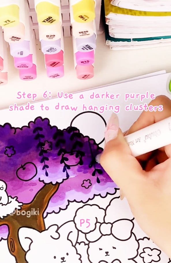
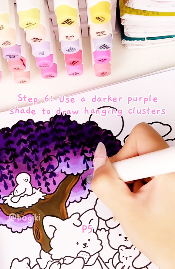
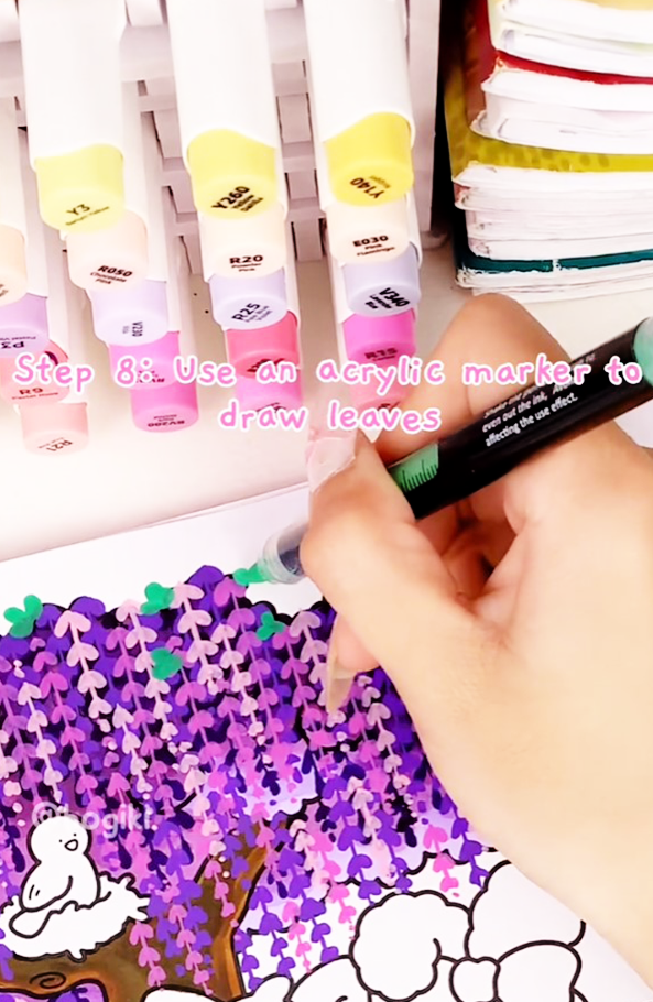
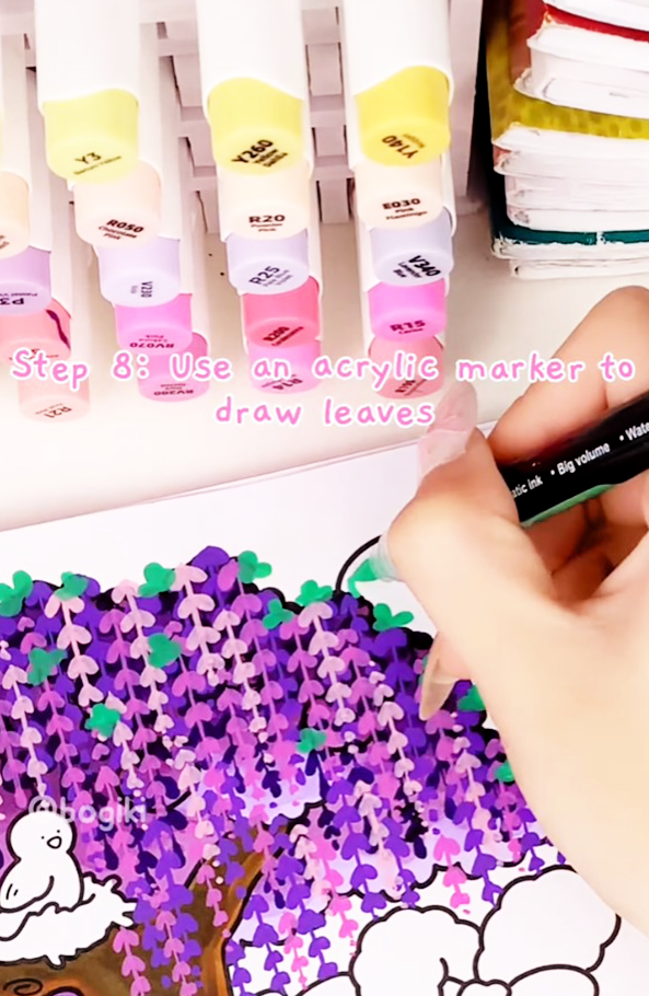
Now comes the most magical part—drawing the hanging wisteria flowers. Use the purple marker (P5) to sketch soft, flowing strands cascading downward from the branches.
Let your lines curve gently and vary in length. Wisteria blossoms are known for their graceful movement, so allow your hand to relax. This step transforms your work from a basic tree into a recognizable and enchanting wisteria tree drawing.
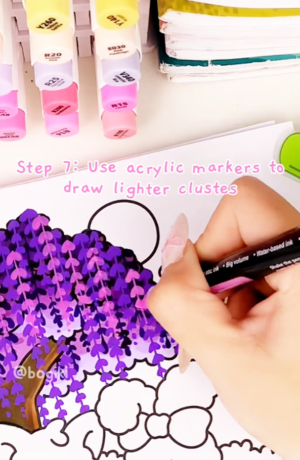
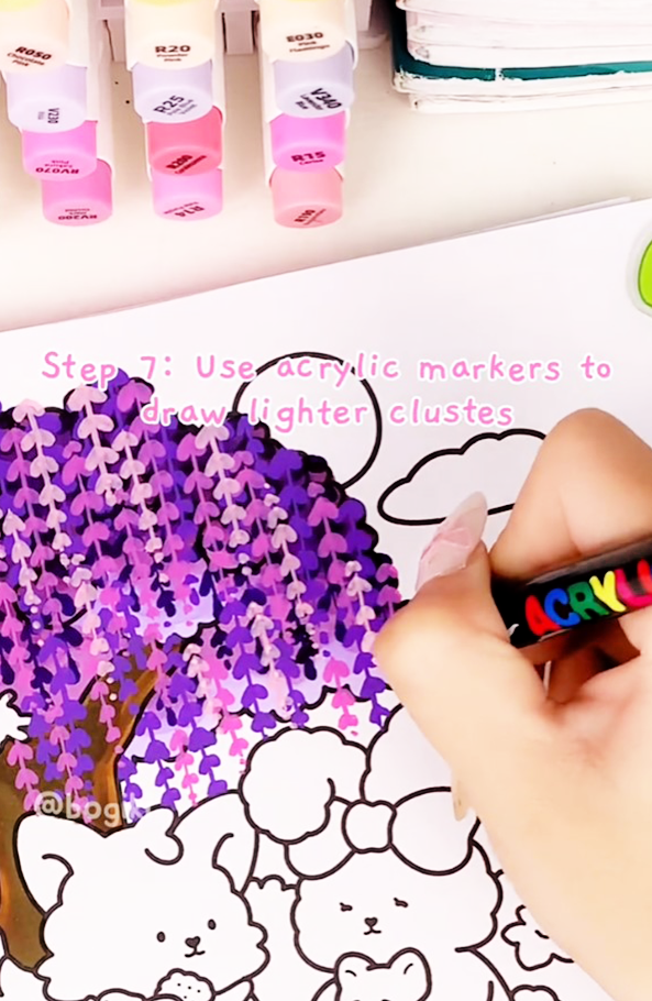
To make the blossoms glow, add layers of darker and lighter pinks and purples. Alternate colors naturally, allowing some strands to overlap while others remain lighter.
This layering technique adds sparkle and movement, making the tree feel alive and whimsical. It’s a lovely way to practice expressive coloring while learning how to draw wisteria tree scenes that feel romantic and soft.
Finally, add small touches of green leaves near the top of the tree. Keep these details subtle—just enough to balance the purple tones and guide the viewer’s eye upward.
These gentle green accents complete the composition and add freshness without overpowering the blossoms, creating a harmonious and peaceful artwork.
These mindful habits are especially helpful when practicing how to draw a tree step by step in a relaxed way.
After finishing your wisteria tree, take a gentle pause and enjoy the calm beauty of your flowing blossoms and soft purple shades. Let this peaceful moment inspire you to explore more nature-inspired coloring scenes.
You can continue developing your tree and landscape skills by learning gentle techniques for drawing grass and flowers, helping you create balanced and harmonious natural scenes. Exploring ways to make your tree drawings feel softer and more dreamy can also add depth and emotion to your artwork.
For a complete cozy coloring experience, you can bring these techniques to life in the Garden Coloring Book, filled with tranquil landscapes, graceful trees, and whimsical scenes designed to help you relax and unwind through art.
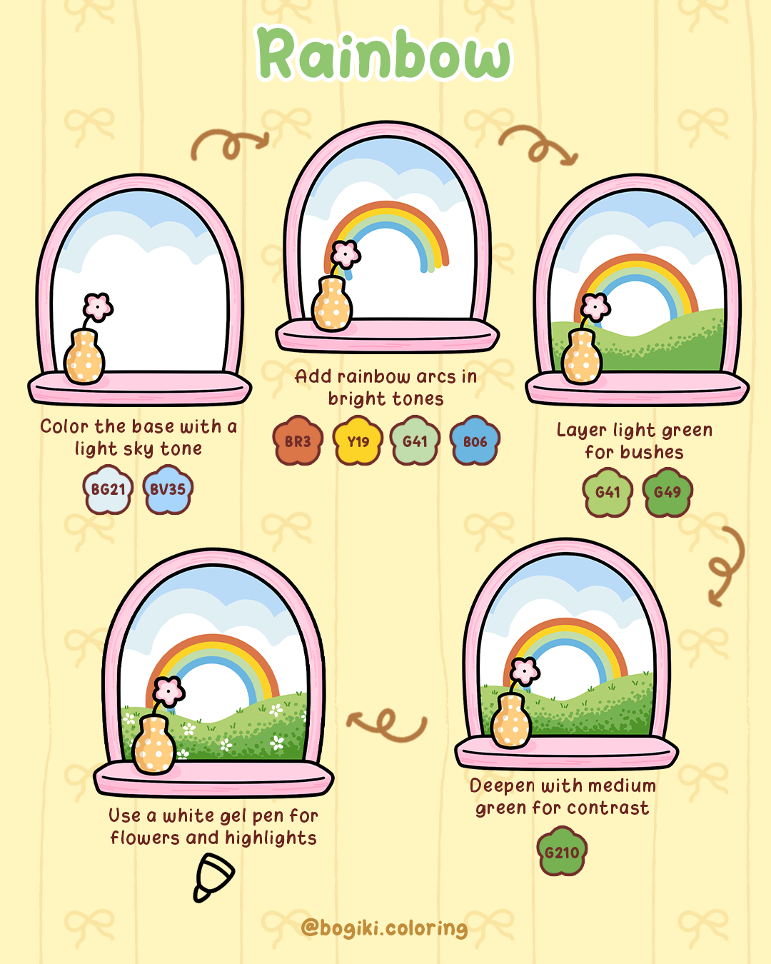
Creating dreamy skies for your coloring book pages can bring a magical, cozy feeling to your artwork. From soft sunrises to vibrant sunsets, cheerful rainbows, or dramatic stormy skies, these sky drawing ideas will guide you step by step. Learn how to blend colors, add gentle highlights, and create depth in your sky drawing. Whether you’re practicing drawings of the sky or exploring sky drawing tutorials, these tips help your artwork feel enchanting, calming, and perfect for coloring books.
A rainbow in the sky instantly lifts the mood. Its soft curves and bright colors turn simple drawings in the sky into joyful, whimsical scenes that feel light and welcoming.
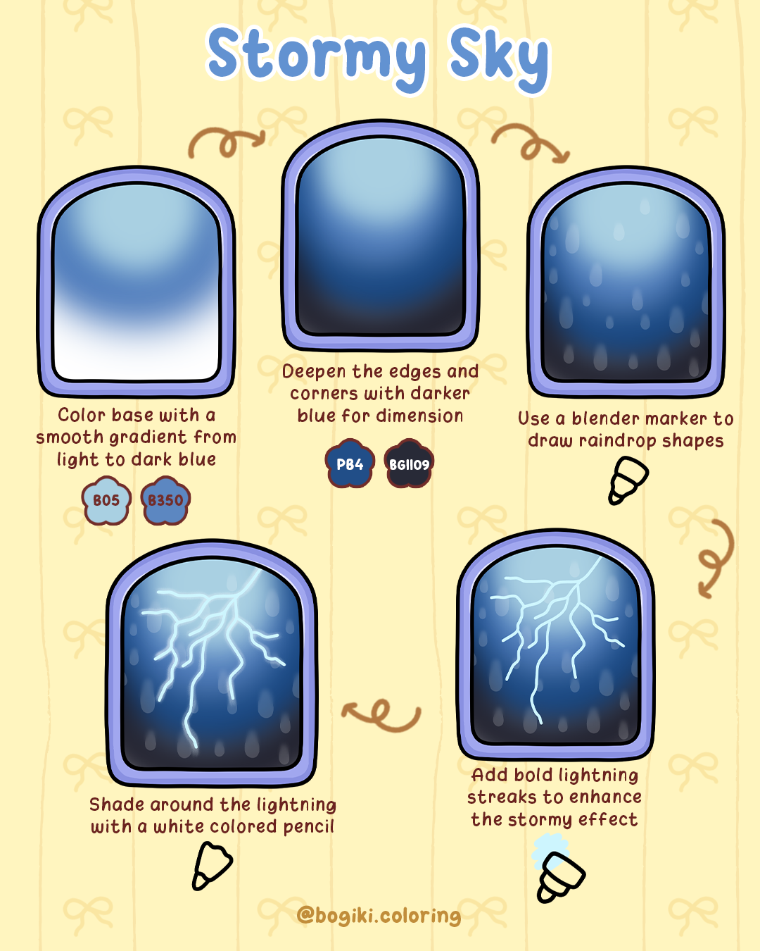
A stormy sky drawing brings movement and energy to drawings of the sky. Layered blues and glowing lightning create a dramatic atmosphere while still feeling balanced and cozy.
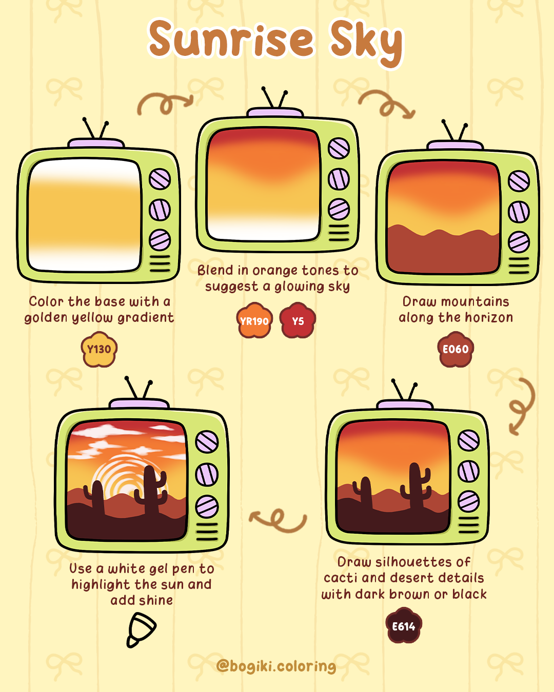
A sunrise sky captures quiet beginnings and peaceful transitions. This sky drawing idea focuses on patience, soft blending, and warm tones.
Sunset Sky Drawing brings warmth and richness to drawings in the sky. Exploring sunset skies helps you practice smooth color transitions and gentle cloud textures, creating a cozy, dreamy atmosphere perfect for coloring books.
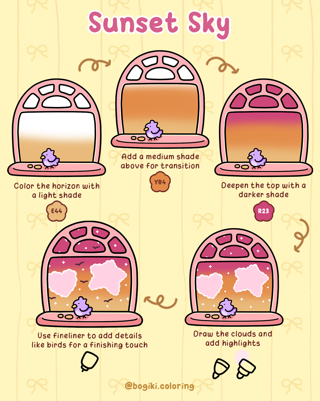
After filling your sky drawing with soft sunrises, glowing sunsets, playful rainbows, and dramatic stormy skies, take a gentle pause to enjoy the soothing rhythm of blending colors, shading clouds, and adding tiny details like birds or distant hills. Let each stroke guide you into a peaceful, cozy world where creativity and relaxation flow naturally.
Try the moon and night sky tutorial for gentle tips on creating soft glows, sparkling stars, and cozy nighttime skies that complement your daytime sky scenes. You can also continue exploring step-by-step water tutorials to practice subtle layering, smooth transitions, and highlights—techniques that bring even more magic to your sky drawings.
For an even fuller cozy coloring experience, discover the fantasy coloring book, where magical skies, whimsical landscapes, and gentle scenes await, allowing you to continue your joyful and mindful coloring adventure.
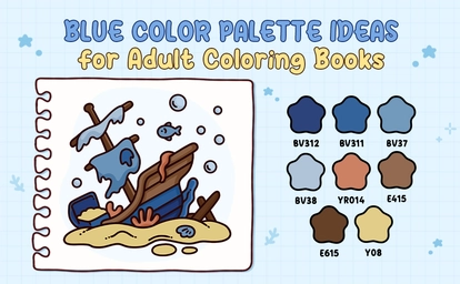
A blue color palette is one of the most comforting choices for adult coloring books. Blue tones help slow the mind, soften visual tension, and create a calm emotional rhythm while coloring.
Instead of overwhelming the page with too many contrasts, this guide focuses on how to pair blue-based palettes with one carefully chosen supporting mood, helping colorists see, choose, and apply colors intuitively.
A blue green color palette feels like balance. Not too cool. Not too warm. Just enough of both to feel safe and familiar. Blue brings stillness, while green adds a quiet sense of life. Together, they create a palette that feels naturally calming and almost instinctive.
This combination works beautifully when you want coloring to feel easy on the eyes and emotionally reassuring, especially during longer sessions. Instead of a strong contrast, blue-green tones flow into each other softly. The page feels breathable, never crowded.
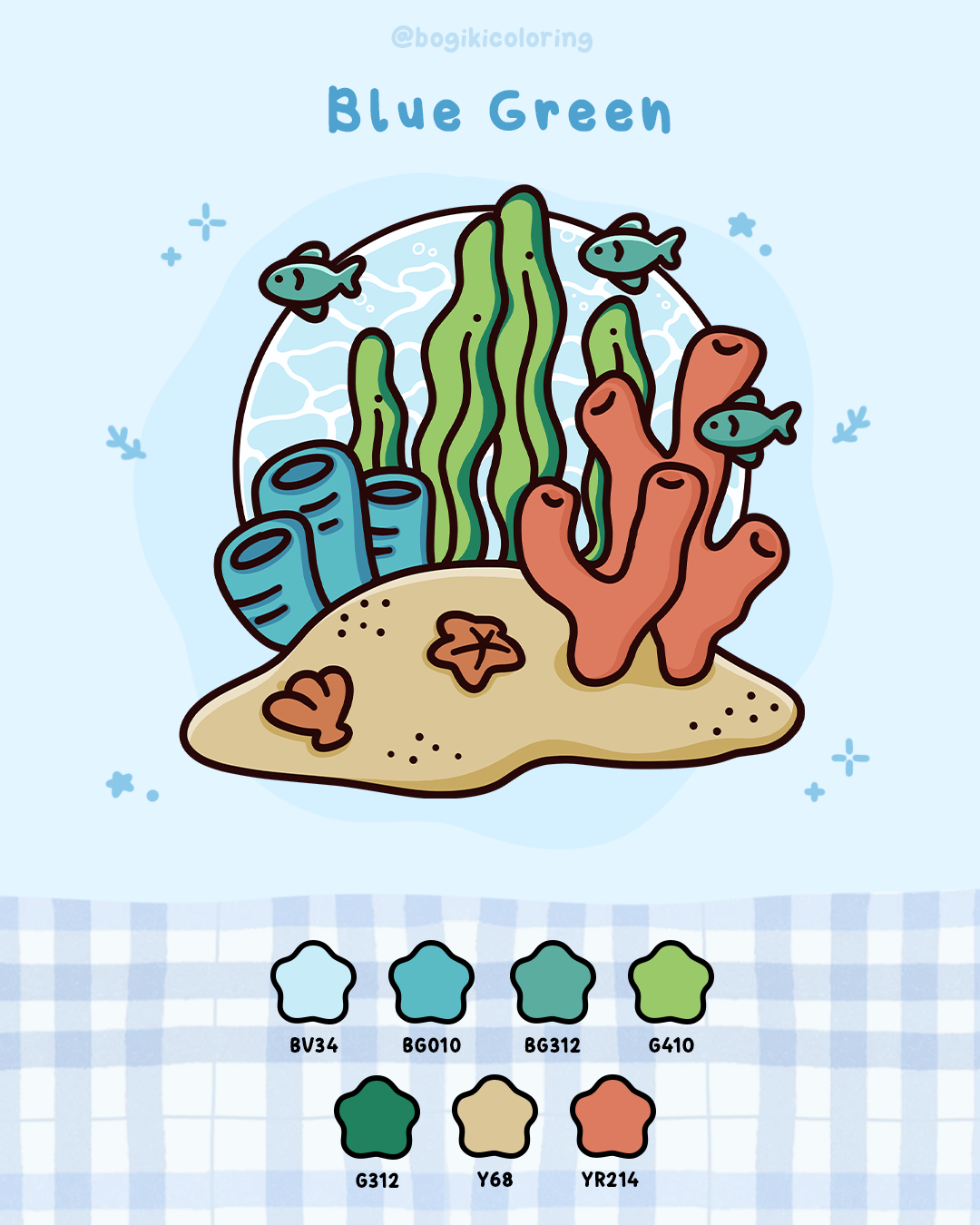
A soft touch of warm tones helps blue green feel calmer and more inviting. These shades gently warm the palette, making coloring feel relaxed, natural, and emotionally comforting.
Suggested warm colors:
This palette often overlaps with the color palette turquoise blue, making it ideal for gentle water or nature moods.
A navy blue color palette feels quiet and deep, like coloring at night when everything slows down. The Navy doesn’t rush the eye. It encourages patience and focus, making each stroke feel more intentional.
When balanced softly, navy feels elegant and comforting rather than heavy. Instead of filling large areas, the navy works best when it appears where depth is needed. It anchors the page, allowing lighter tones to rest around it.
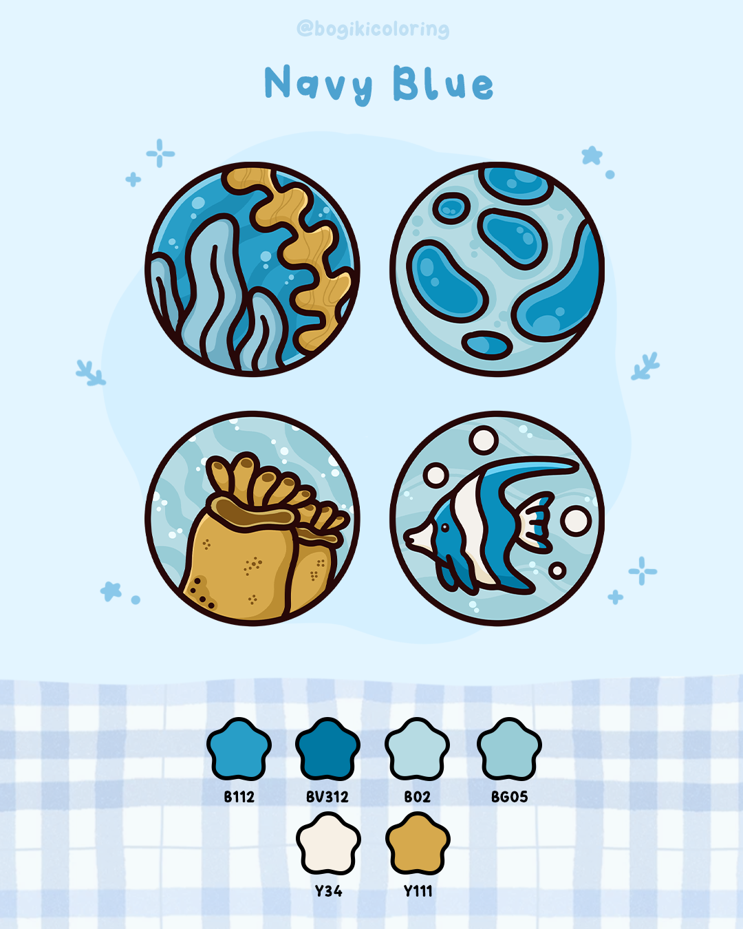
Warm, glowing accents help navy blue feel less heavy and more soothing. These colors add gentle light, creating a calm nighttime mood that feels cozy and slow.
Suggested warm colors:
If you enjoy coloring slowly and thoughtfully, navy blue can turn the page into a calm, focused space.
A blue grey color palette is quite different in a different way. It doesn’t express strong emotion, it gently steps back. Blue grey softens contrast naturally, which helps the mind stay relaxed without stimulation.
This palette is especially comforting for colorists who prefer calm visuals and subtle transitions. Nothing feels sharp or demanding. Every color blends smoothly, allowing the page to feel steady and grounded.
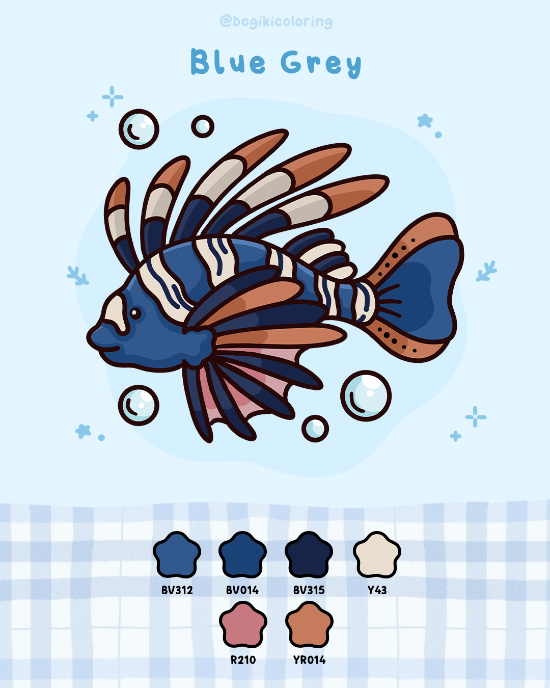
Soft warm neutrals balance blue grey beautifully. They keep the palette quiet and grounded, helping the page feel peaceful, gentle, and easy on the eyes.
Suggested warm colors:
This palette pairs beautifully with a dusty blue color palette or slate blue color palette aesthetic.
A light blue color palette feels open and gentle like giving the page more air. Light blue creates space. It prevents visual overload and makes coloring feel effortless, even on detailed pages. This palette is especially comforting when you want coloring to feel light rather than immersive. There’s a sense of ease here. Nothing feels heavy or complicated.
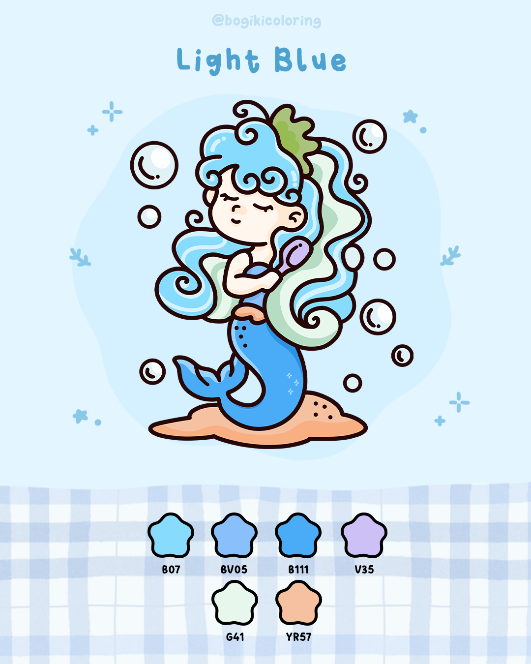
Light blue becomes warmer and more comforting with gentle pastel accents. These colors keep the palette airy while adding softness and emotional ease to the page.
Suggested warm colors:
This palette is perfect for beginners or for days when you want coloring to feel soothing rather than absorbing.
A dark blue color palette adds emotional depth. It feels thoughtful, slightly serious, and quietly immersive. Dark blue works best when used with intention. Instead of dominating the page, it guides the eye and creates focus. When balanced with warmer tones, it feels grounded rather than overwhelming. This palette suits moments when you want to slow down and fully sink into the page.
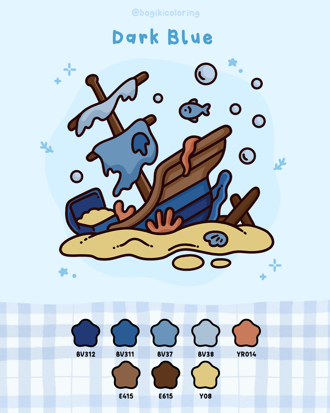
Warm, earthy highlights help dark blue feel grounded and cozy. These tones soften the depth of blue, making the palette feel calm, balanced, and inviting.
Suggested warm colors:
Used gently, dark blue adds richness without taking away the calm.
Blue feels especially comforting in adult coloring books because it moves quietly across the page. Instead of standing out, it creates space allowing each shape and pattern to feel softer and easier to color.
When working with any blue color palette
These blue palettes can be applied beautifully to water and snow patterns, where softness and flow matter most. Winter scenes with gentle frost and layered snow naturally suit calm blue tones, making cozy collections like the Hygge Frosty Coloring Book a relaxing place to explore these moods. If you’re not sure how to shape snow textures or layer blue softly, learning how to draw snow step by step for winter coloring pages can help you understand how light, shadow, and blue tones work together naturally.
The same idea applies to ocean-inspired patterns, where blue moves more freely and smoothly. Water scenes in books like the Ocean Oasis Coloring Book allow blue palettes to flow across the page with ease. If you’d like more guidance on building gentle water effects, this how to color water step by step tutorial can support you in creating calm, seamless transitions without overthinking. With blue, coloring becomes less about technique and more about staying present with each quiet moment.
Treat your inbox to a lovely surprise! Sign up now for exclusive content and special gifts