
Both beginners and experts can enjoy books.

Prevents bleed-through and protects every design.

Every design is created by skilled human artists.

Trusted and loved by coloring fans worldwide.
You have questions? We're here to help.
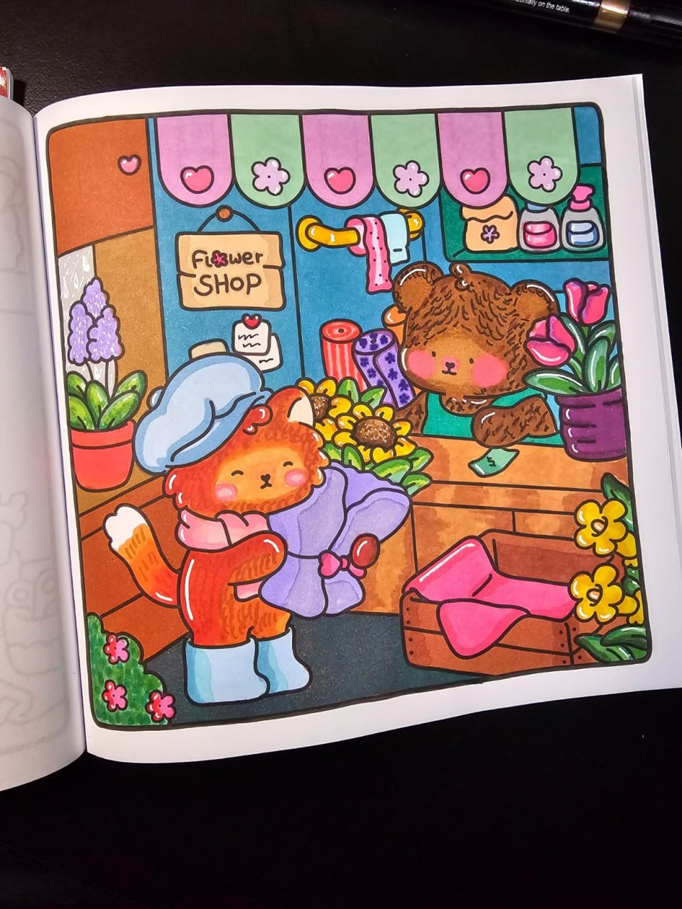
Fuzzy Buddies is an enjoyable coloring book. I love seeing the pages come to life after coloring. Great buy.
Amazon customer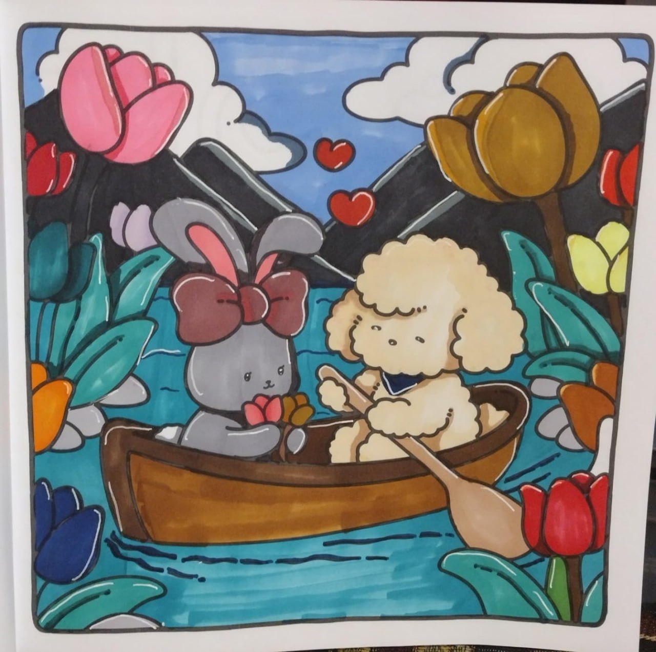
I bought this for my fiance and she loves it! It's adorable and she says it's fun to draw. I love it! It also came in a day early!
Amazon customer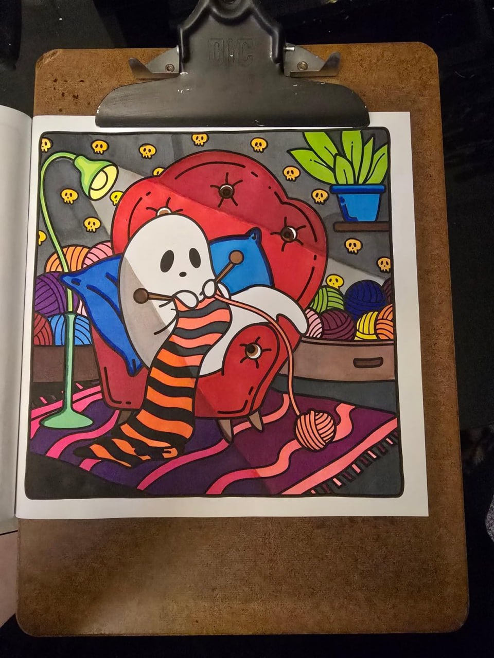
Such a cute and fun book to color. I can't put it down! I love how easy they are.
Amazon customer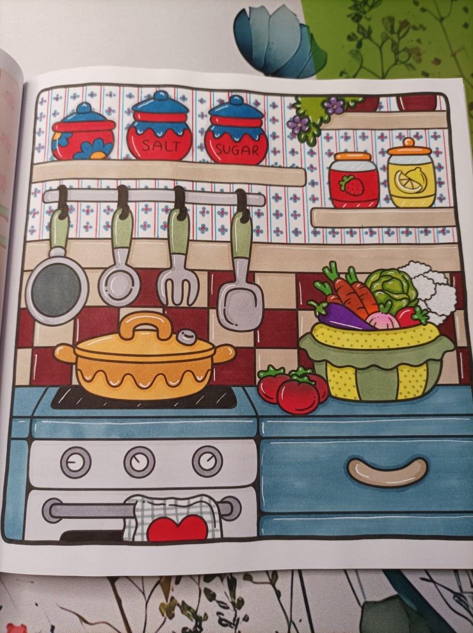
This book is a gem: the drawings are very well done, clear and realistic. The scenes are very varied. Well suited for coloring with alcohol markers in this case. I recommend +++
Amazon customer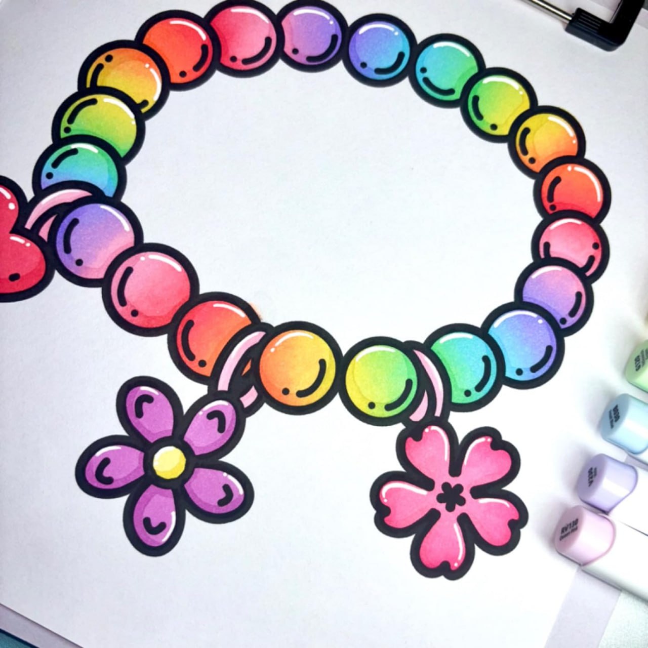
This colouring book is so cute! The line art is black and thick which is ideal for colouring with alcohol markers. The designs are all super cute! There are pages in this book that I haven’t seen in other books. I recommend 👍
Amazon customer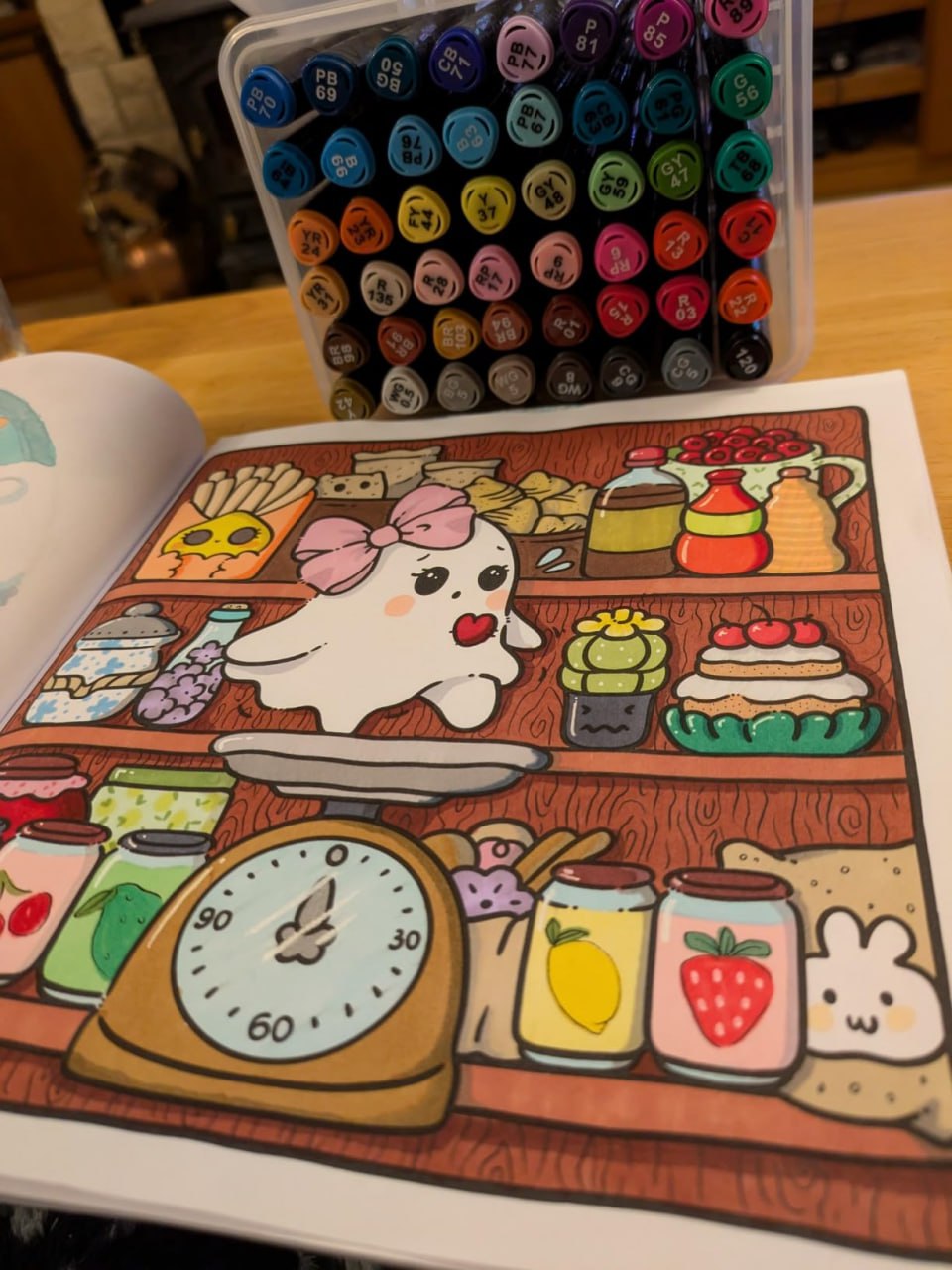
I caved and joined in the cute Halloweeny colouring bandwagon! I'm happy with this book, it's so cute! I like the size, it's not too big so it's easier to complete. Very cute designs. The paper is thinner than I'd like but it's okay if you put card behind the page you're working on.
Amazon customer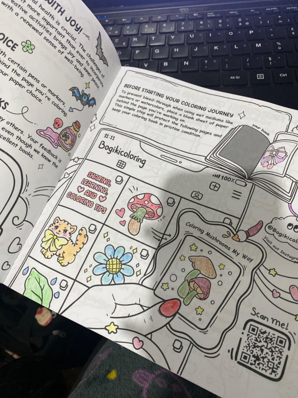
What a dream to have a pleasant time at any age coloring these very funny drawings. Really I recommend it feels good and relaxing as much as possible doing mandalas for those who like it.
Amazon customer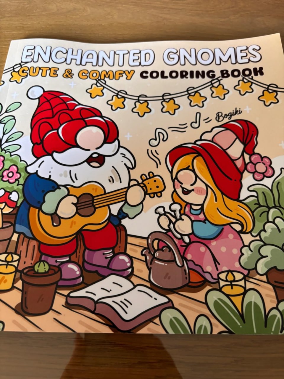
I bought it for my grandma so she wouldn't be bored this winter, she loves everything related to the fairy world, goblins etc... The designs are very cute and varied! The leaves look fine so in my opinion it is not made for people who have alcohol markers.
Amazon customer
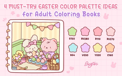
Easter is a soft and joyful moment where colors begin to feel lighter, warmer, and full of gentle life. From fresh spring greens to delicate pastels and playful festive tones, each easter color palette reflects a different side of the season. In this guide, you will explore four cozy palettes inspired by Easter scenes, helping you bring warmth, charm, and quiet happiness into your coloring pages.
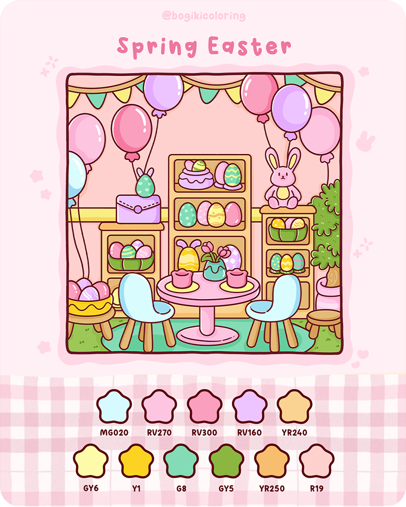
The spring easter color palette captures the lively feeling of a space filled with celebration and fresh energy. Soft greens, warm yellows, and light pinks blend with brighter accents, creating a scene that feels both cheerful and balanced. It reflects the joy of gathering, decorating, and welcoming a new season, where everything feels open, bright, and full of life.
This palette complements beautifully with illustrations that capture beautifully decorated indoor spaces and small, festive setups. Scenes filled with shelves, tables, and Easter decorations allow each color to stand out while still feeling harmonious. You can explore this cozy and detailed environment through the Hygge Corner Coloring Book, where layered elements provide space to create soft and lively color compositions.
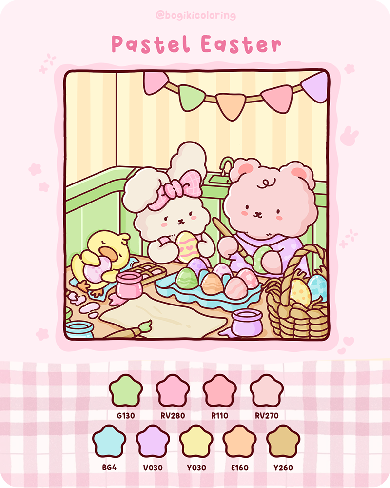
The pastel easter color palette feels gentle, warm, and quietly joyful. It softens every detail, creating a calm and comforting atmosphere where colors blend smoothly without strong contrast. Light pinks, soft greens, creamy yellows, and muted purples come together to form a delicate harmony, perfect for slow and mindful coloring.
With its soft and friendly feeling, this palette works especially well in illustrations that focus on characters and small interactions. Scenes where animals quietly paint or decorate eggs can feel even more charming when colored with light tones. You can find this kind of gentle storytelling style in the Spring Moment Coloring Book, where simple actions and soft details create a calm and cozy coloring experience.
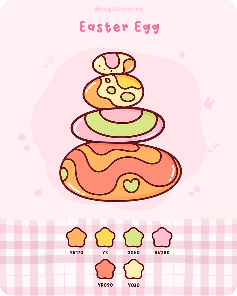
The easter egg color palette brings a playful and slightly bold energy while still keeping a warm and friendly tone. Inspired by decorated eggs, this palette combines soft orange, warm yellow, light green, and pink accents in a way that feels both simple and eye-catching. It creates a sense of focus, where a few colors work together to highlight shape and design.
This palette works best in illustrations that are simple in structure but strong in visual focus. Designs with clear shapes and fewer details allow the colors to become the main highlight. In the Comfy Patterns Coloring Book, similar clean and relaxing compositions give you space to experiment with color balance, making each page feel both playful and satisfying.
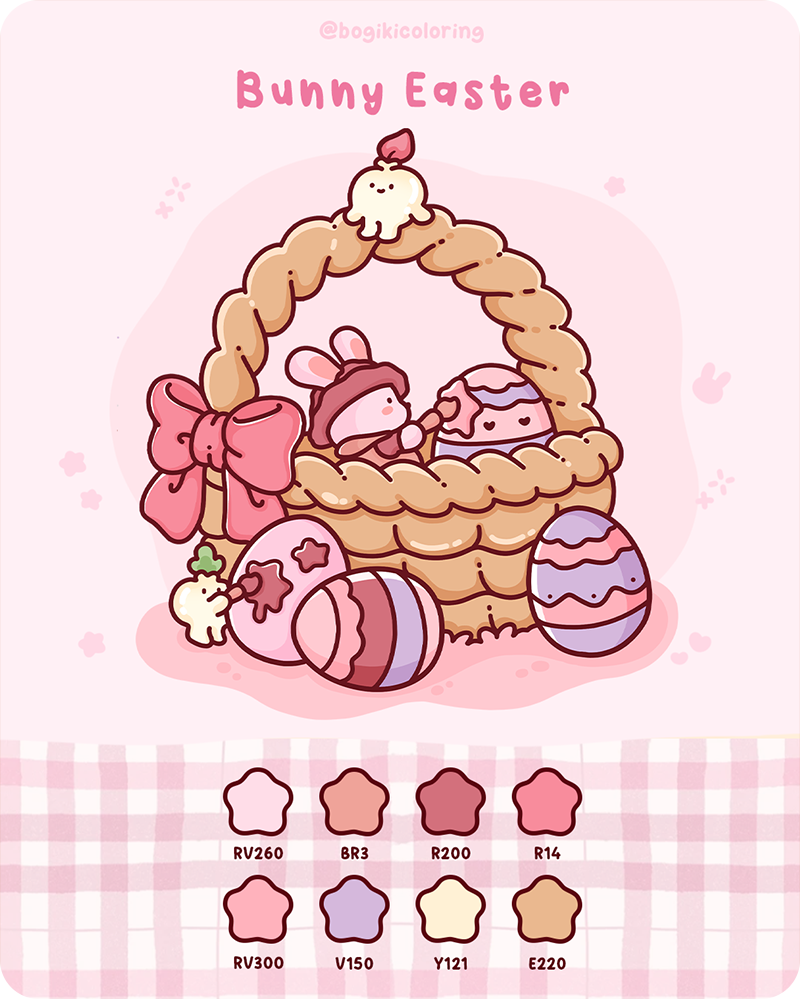
The Bunny Easter Color Palette feels warm, soft, and full of gentle affection. It focuses on cozy tones like blush pink, cream, and light brown, creating a comforting and intimate atmosphere. Inspired by small, caring moments, this palette brings a sense of quiet happiness, where everything feels soft, safe, and close.
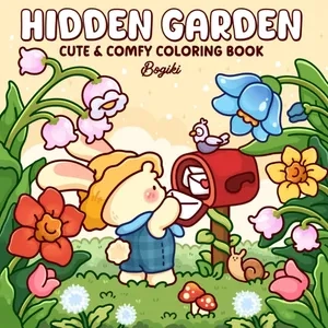
This palette naturally fits illustrations that highlight cute characters and cozy details. Scenes centered around a bunny, a basket, and a few carefully placed objects can feel especially warm when colored with soft tones. The Hidden Garden Coloring Book reflects this quiet and comforting style, offering pages where each color choice helps build a sense of calm and gentle storytelling.
When choosing an Easter color palette, start by noticing the feeling you want your page to hold. If you are drawn to something fresh and lively, lighter greens and warm yellows can bring that sense of spring energy. If you prefer a softer and more calming mood, pastel tones will help everything feel gentle and relaxed. For something more playful, brighter colors can add a touch of joy and movement.
If you enjoy working with seasonal colors, you can continue exploring other cozy themes like a Christmas color palette with warm, glowing tones, or a Thanksgiving color palette filled with earthy and comforting shades, each offering a different creative mood to discover.
To help you explore this Easter color palette, a free printable page is prepared as a small gift for your creative time. It includes four Easter-themed illustrations inspired by each palette in this guide, allowing you to gently practice layering, blending, and enjoying a calm and relaxing coloring moment at your own pace.
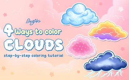
Learning how to draw a cloud step by step can feel like a quiet and comforting creative moment. In this gentle guide, you will explore four different cloud styles, ranging from soft, basic clouds to dreamy, cotton candy skies, glowing sunset clouds, and moody storm clouds. Each small project is designed to help you understand how to draw clouds easily while slowly building confidence with colors, blending, and texture in a calm and enjoyable way.
Soft basic clouds often set the tone for a calm and balanced illustration, which is why they feel like a natural place to begin when learning how to draw a cloud step by step. Their rounded edges and open shape give you space to focus on gentle blending rather than complex details. As you build this simple form, the cloud slowly becomes soft and airy, making it an easy fit for minimal sketches, journal pages, or any artwork that leans toward a quiet and clean aesthetic.
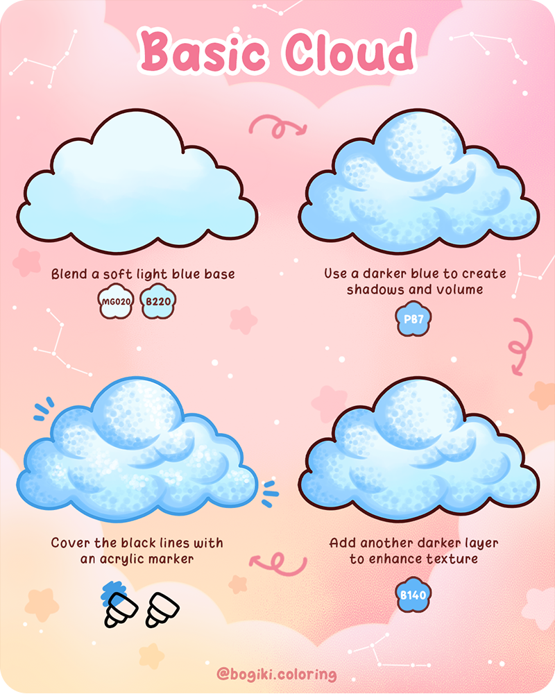
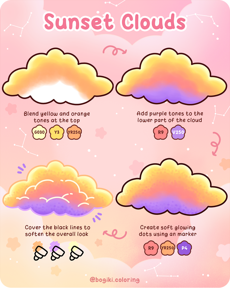
Color begins to take the lead as you move deeper into how to draw a cloud step by step. This is especially true when working with sunset clouds. The blend of warm and cool tones does more than fill the shape; it creates a sense of time and atmosphere within the drawing. As the colors shift from soft yellow to deeper purple, the cloud becomes part of a larger scene, making it especially suited for landscapes, mood-based illustrations, or pages that capture a slow and reflective moment.
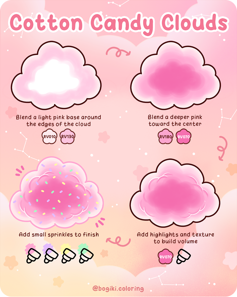
A shift toward softer colors brings a completely different mood to how to draw a cloud step by step, and cotton candy clouds are a perfect example of that change. The way pink tones gather and fade toward the center creates a light, floating effect that feels playful without being overwhelming. This style naturally lends itself to cute compositions, pastel themes, or small decorative pieces where a gentle and cheerful atmosphere is part of the overall design.
Introducing contrast can completely transform how to draw a cloud step by step, and storm clouds bring that change in a strong but controlled way. Their layered shadows and deeper tones give the cloud a sense of weight and movement, while still allowing the blending to stay soft. With the addition of subtle lightning details, the cloud moves beyond a simple shape and becomes a focal point, fitting naturally into storytelling scenes or artwork that carries a more dramatic and expressive tone.
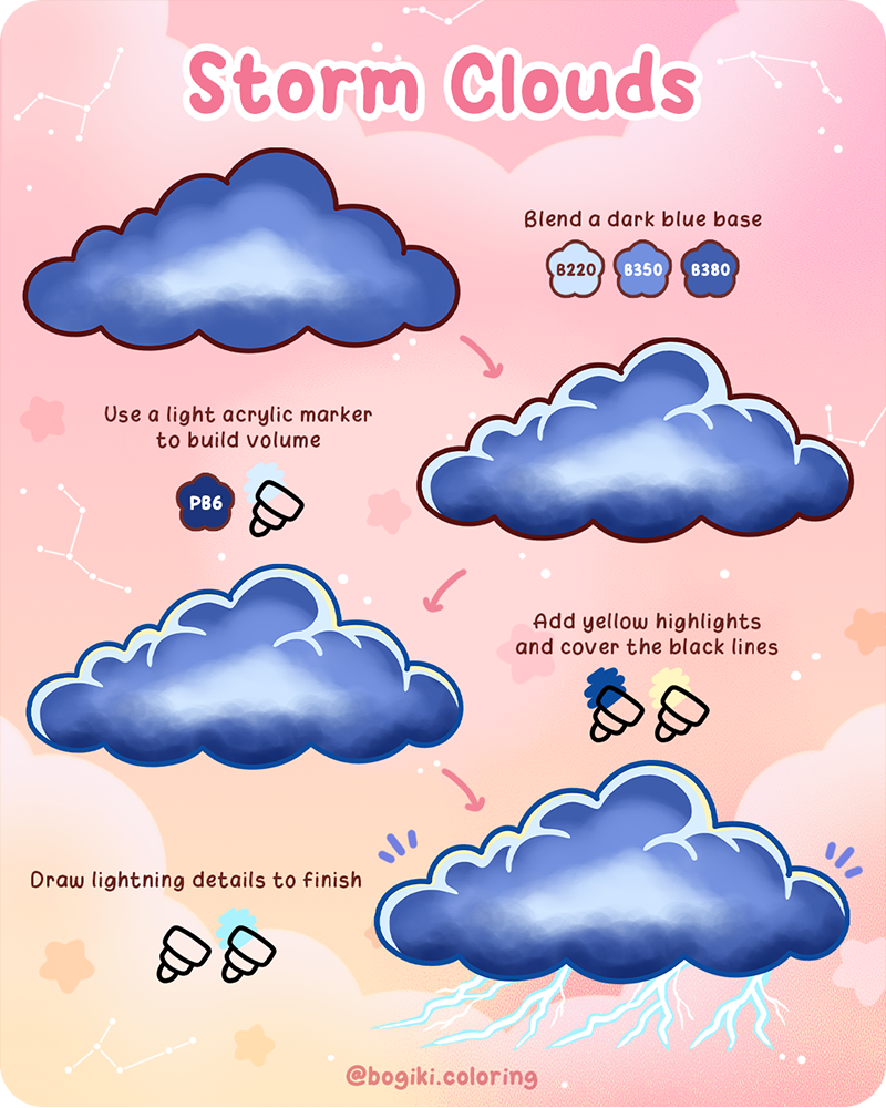
Along with practicing how to draw a cloud step by step, you can slowly expand your ideas by exploring different sky scenes and compositions. Try placing soft clouds into a wide open sky, adding gentle color transitions, or building a full scene with multiple cloud layers. Small changes like these can make your artwork feel more complete and atmospheric.
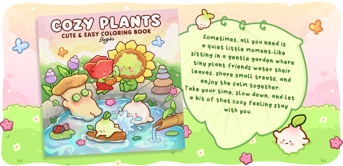
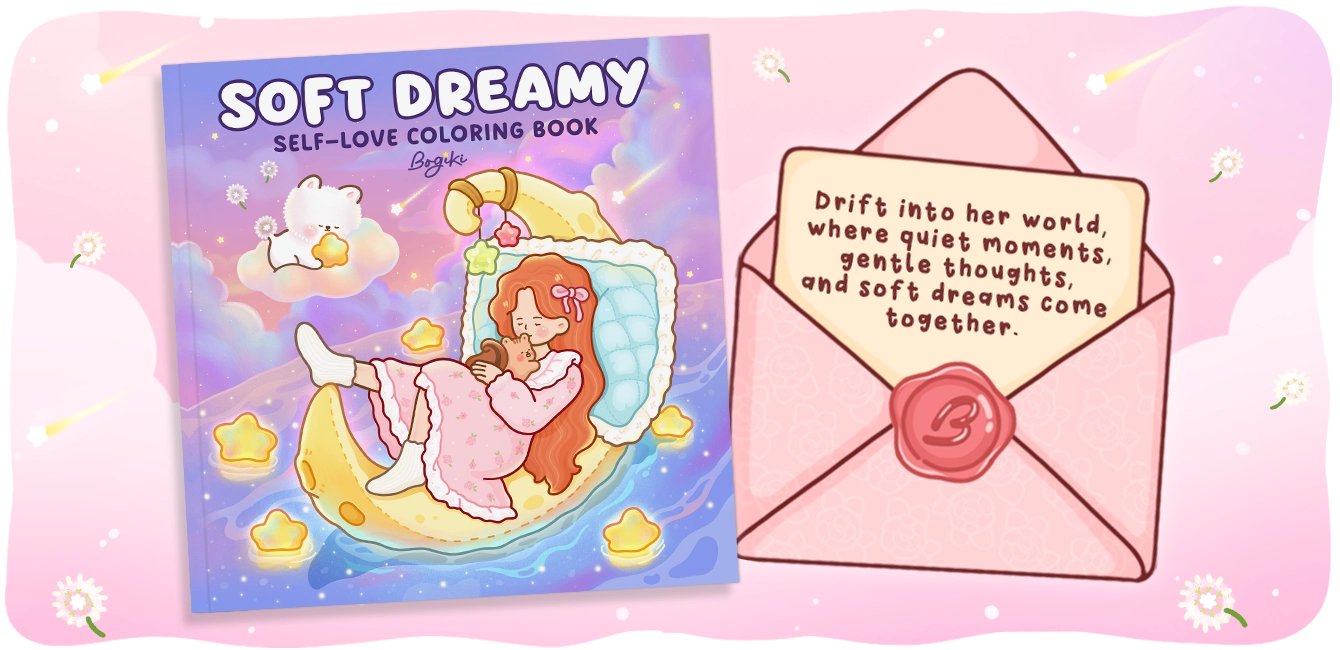
If you would like more inspiration, you can continue with simple guides like 4 Easy Ways to Create Sky Drawings, where different sky moods are explored in a calm and approachable way. You can also bring these ideas into your coloring time through nature-themed pages that feature open skies and soft landscapes. Books like Soft Dreamy Coloring Book create a peaceful space with wide, airy compositions, where clouds and sky elements can be added naturally. Or, if you enjoy a cozier style, Cozy Plants Coloring Book offers gentle scenes with open backgrounds, giving you room to experiment with clouds, colors, and soft sky details in your own way.
To help you continue your how to draw a cloud step by step journey, a free printable page is prepared as a small gift for you to practice. This page includes all four cloud styles from the guide, from soft basic clouds to cotton candy, sunset, and storm variations, arranged in a simple and easy to follow layout.
You can use this page to slowly practice blending, layering colors, and adding small details at your own pace. Just enjoy the process, let each cloud come together gently, and turn this small practice into a quiet and relaxing creative moment.
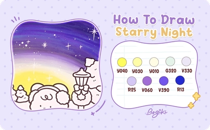
Learning how to draw Starry Night step by step easy can begin in a very quiet way, with just a few soft colors and a gentle curve across the page. In this tutorial, you will explore how to draw a starry night sky through simple blending, curved color transitions, and small glowing details. The process is slow, beginner-friendly, and easy to follow, helping you create a peaceful starry night drawing that feels soft, natural, and quietly magical.
Start learning how to draw Starry Night step by step easy, by focusing on the most important part of your drawing, the sky itself. This step sets the mood for everything that comes after, so take your time and let the colors build slowly.
Begin with a bright yellow marker, Y040, and draw a soft curved line along the horizon. This line does not need to be perfect. Let it flow naturally, like a gentle wave. This will become the first layer of your gradient sky, adding a quiet warmth to your starry night sky drawing.
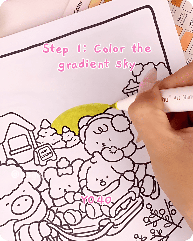
Next, use Y030 to lightly blend over the yellow layer. Move your hand slowly and allow the colors to soften into each other. This creates a smooth transition that feels calm and breathable.
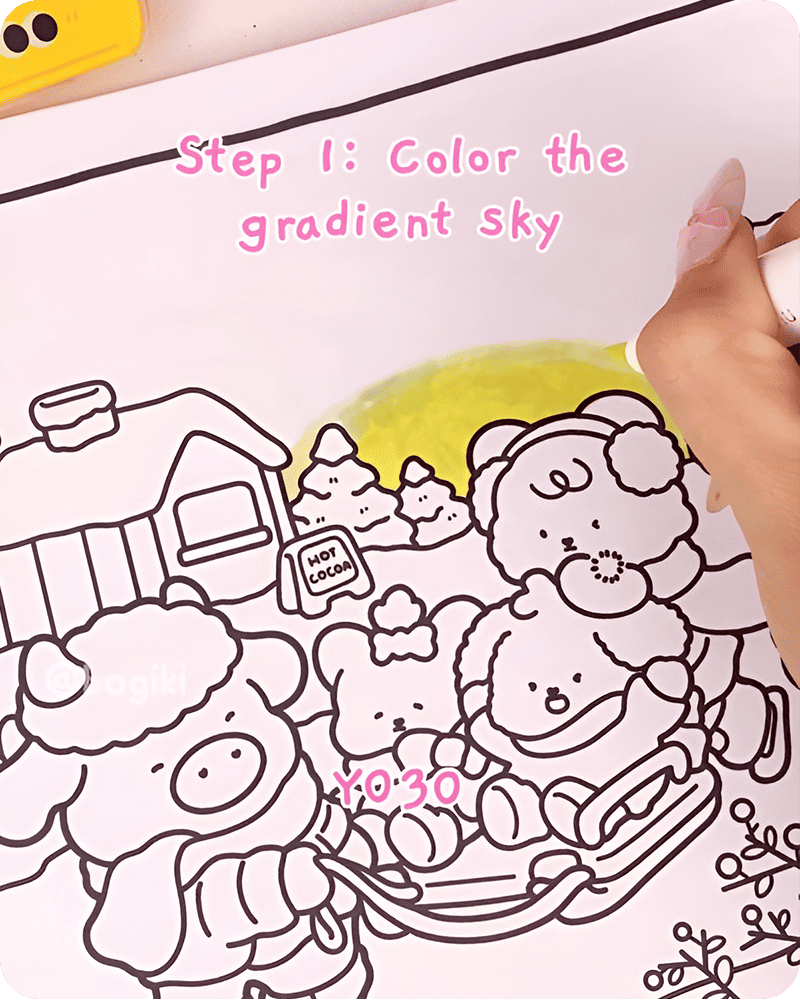
Now introduce a soft turquoise tone using G320. Layer it gently above the blended yellow area. Try not to press too hard. Let the color sit lightly on the page so it can blend naturally with the warm tones below.
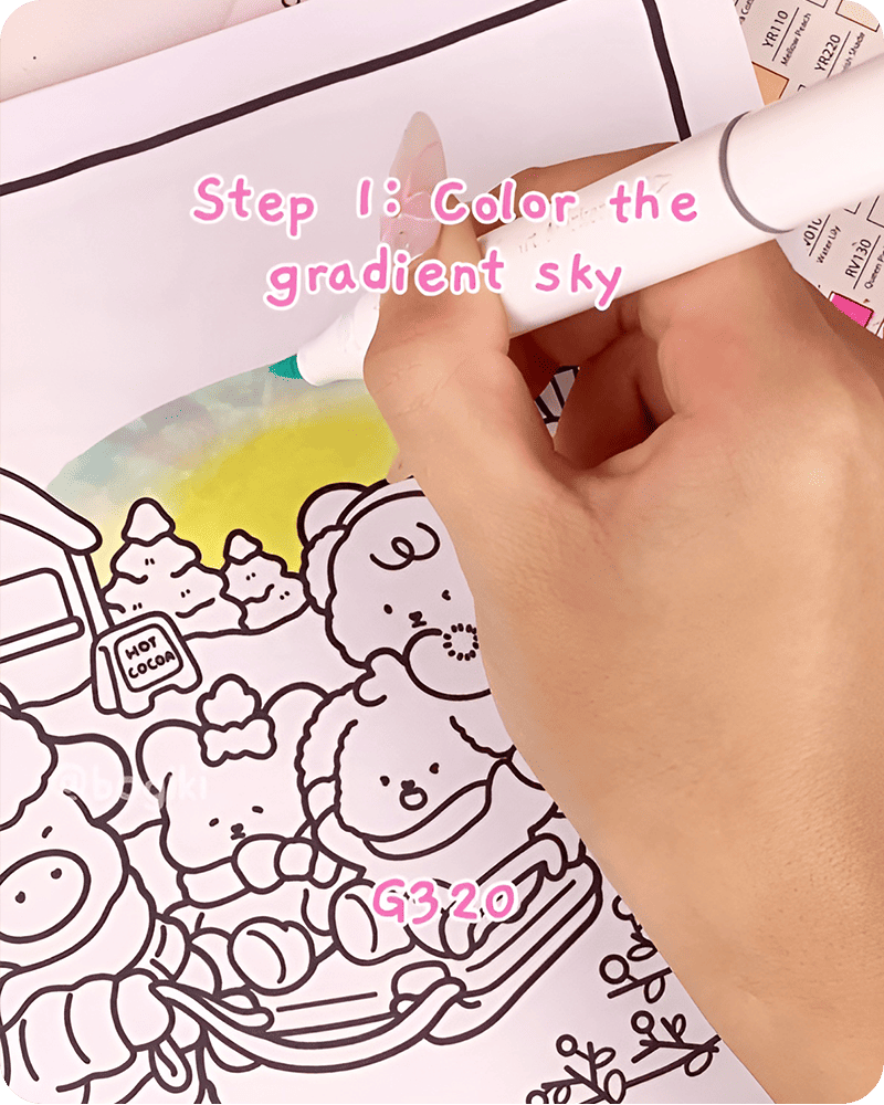
As you continue how to draw Starry Night, begin building the deeper tones of the sky. Use a light purple V330 and softly blend upward following the curve of the horizon.
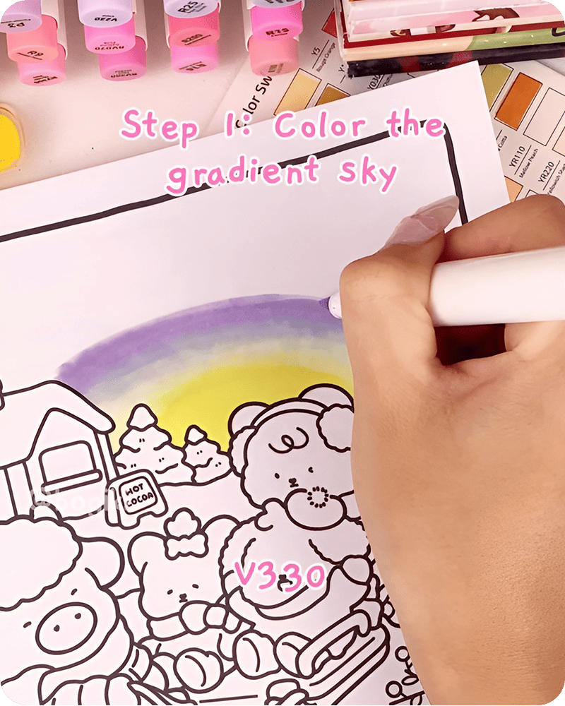
Then gradually deepen the gradient using R25 and V060. Keep your strokes curved and gentle, allowing the colors to flow together without harsh lines.
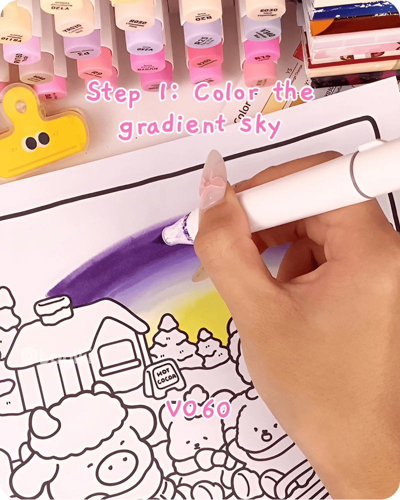
Finally, complete the gradient with a deep dark blue V390 and R13. Fill the remaining upper sky with this color, letting it softly merge into the purple tones below.
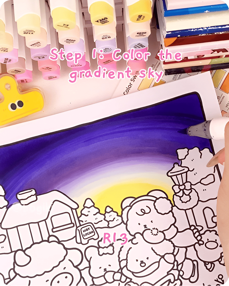
This part of how to draw Starry Night step by step easy shows how simple color layering can transform a blank page into a soft and atmospheric background.
Continue your starry night drawing by adding gentle texture across the sky. Using colored pencils in pink, blue, and yellow, begin sketching light curved lines across different parts of the sky. These lines should feel loose and natural, almost like the glow of stars stretching gently across the night.
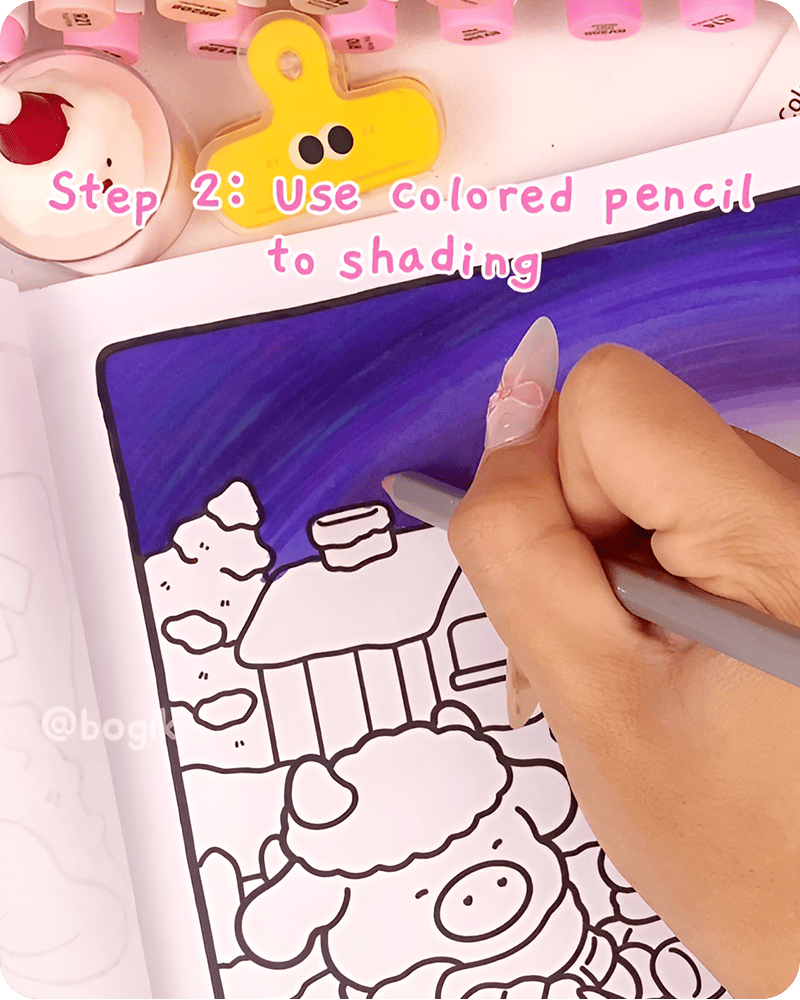
As you explore how to draw Starry Night, try layering these colors lightly over one another. Let some areas remain soft and subtle, while others become slightly brighter. This variation creates a sense of movement and depth, making your drawing of Starry Night feel more alive.
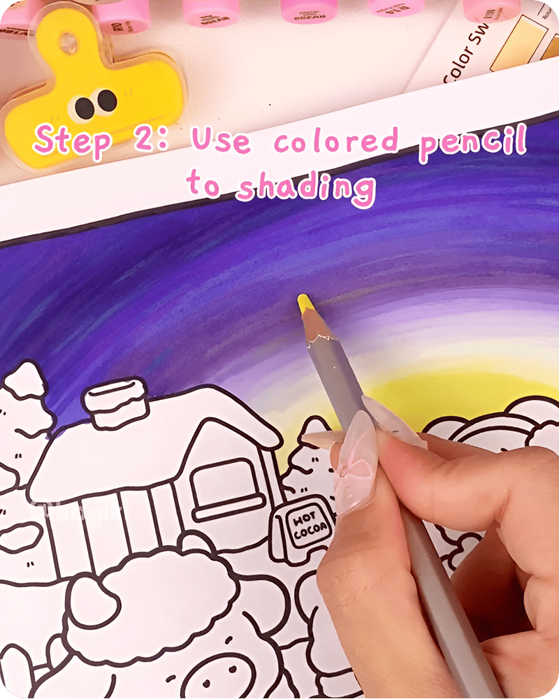
In many approaches to how to draw Starry Night step by step easy, this step is where the sky begins to feel more expressive. These gentle textures act like quiet energy flowing through the night.
Now move into the final stage of how to draw Starry Night step by step easy, where small details bring everything together. Using a white acrylic marker, begin by placing tiny dots across the sky. These dots represent distant stars. Keep them small and scattered, allowing some areas to have more stars than others. This creates a natural and balanced look.
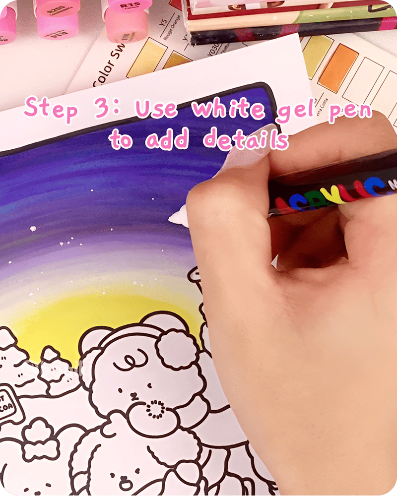
Next, take a white gel pen and draw a few larger stars. You can create simple star shapes by drawing small crosses or soft, glowing lines. Focus on only a few areas rather than filling the entire sky. This helps the highlights stand out more clearly.
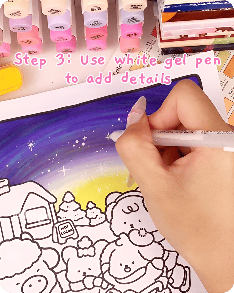
To finish, you can add a few extra dots or tiny lines around your stars to create a gentle glow. These final touches are simple, but they often bring the most charm to a simple starry night drawing.
If you want to see the full process of how to draw Starry Night step by step easy more clearly, you can watch the video tutorial. It shows how each color is added and how the layers blend together step by step. Watching in real time can help you understand the flow of the drawing better, especially when working with soft gradients and curved strokes.
You can pause at any time and follow along at your own pace. There is no need to rush. Just take it step by step and enjoy the process as your starry night slowly comes together.
When you finish learning how to draw Starry Night step by step easy, take a quiet moment to look at it as a whole. The colors have slowly settled into each other, and with just a few small details, the sky begins to feel deeper and more alive.
If you feel like continuing, you can gently expand your scene by adding a moon or a few simple night elements. A guide like how to draw the moon and night sky can help you connect these details naturally, so everything flows together in a soft and balanced way.
This drawing is also inspired by pages from the Fuzzy Frosty coloring book. You can print it out or use the digital version to try different color combinations, practice blending, and explore what feels right for you. There is no need to do too much at once. Just add a little each time, and let your drawing grow in a way that feels calm and natural.
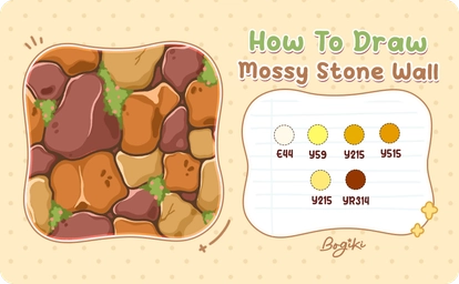
Learning how to draw a stone wall step by step can feel like a quiet, grounding experience. What begins as simple shapes and soft colors turns into a textured surface full of warmth and character. In this gentle guide, you will explore how to build a cozy stone wall drawing through layered tones, natural imperfections, and small, thoughtful details that bring everything to life.
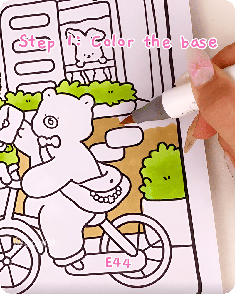
Begin learning how to draw a stone wall step by step by laying down a soft and even base. Using a light brown tone, such as E44, gently color the entire wall area. Let your hand move slowly so the color feels smooth and calm across the page. This base acts like the foundation of your stone wall texture drawing.
Next, take a slightly warmer and brighter tone like Y59. Begin filling in a few stones that appear to sit slightly forward. Let them feel natural, almost like they appeared on their own. This is where your stone wall drawing style begins to take shape.
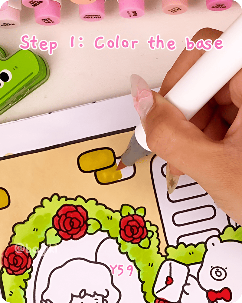
As you continue exploring how to draw a stone wall step by step, this soft beginning helps your drawing feel relaxed instead of overwhelming.
Using a deeper brown tone, start adding irregular patches across the surface. When practicing how to draw stones on a wall, avoid making shapes too round or too even. Let them stretch, bend, and shift in quiet, unexpected ways. These uneven patches create the natural feeling that makes a stone wall drawing come alive.
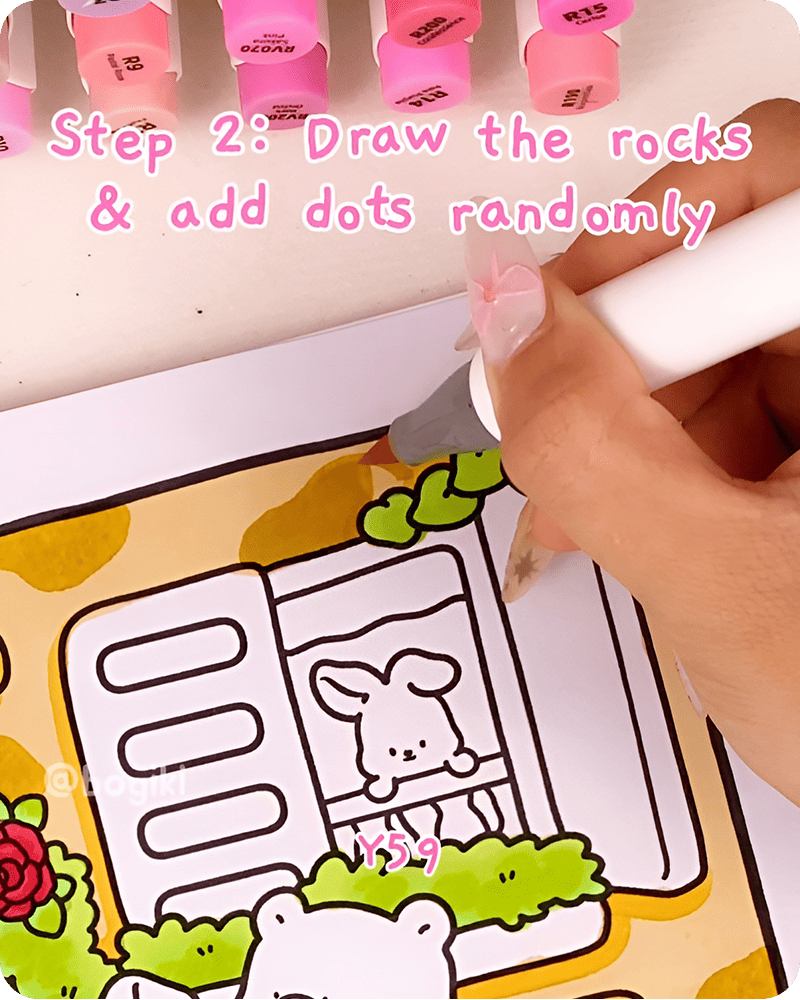
Then, introduce additional tones like Y215 and Y515. Layer them gently between the existing shapes. Think of this as building a mosaic of earthy colors, where each piece connects but still stands on its own.
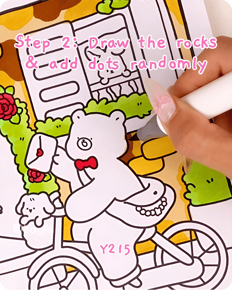
As you layer these tones, your drawing of stone wall surfaces will begin to feel more dimensional. Some areas will appear closer, others slightly deeper, even without sharp outlines.
To complete this step, add small scattered dots across the wall. These tiny marks may seem simple, but they bring a sense of age and history. They help transform your simple stone wall drawing into something that feels older, quieter.
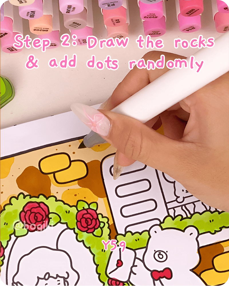
When learning how to draw a stone wall step by step, it is often these small, random details that make the biggest difference.
Using a darker brown marker like Y215, begin adding shadows beneath and around some of the stones. Focus on areas where stones overlap or where edges naturally create depth. There is no need to shade everything. In fact, leaving some areas untouched helps your stone wall drawing easy style remain soft and breathable.
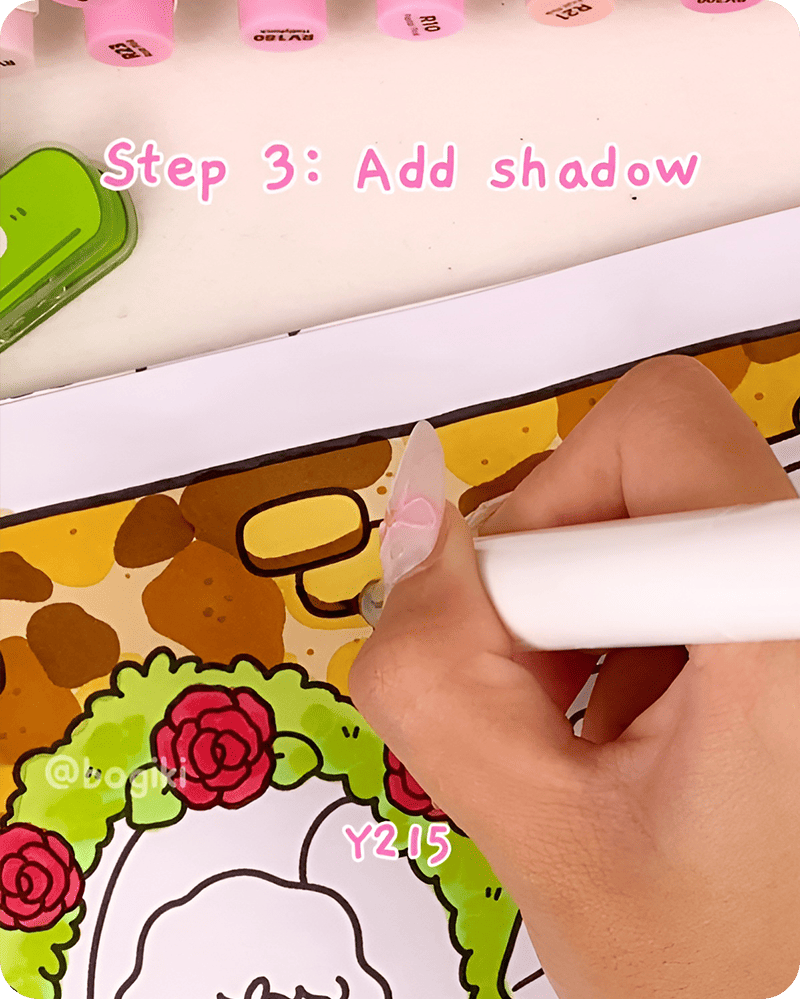
This step in how to draw a stone wall step by step is not about precision. It is about suggestions. A little shadow here and there is enough to guide the eye.
To deepen the texture, take a slightly richer tone like YR314 and begin adding fine lines across the wall. These lines can follow the edges of stones or appear as small cracks. When practicing stone wall texture drawing, these subtle details help create the illusion of age and natural wear.
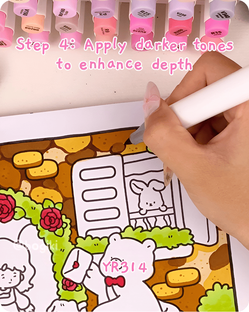
At this stage of how to draw a stone wall step by step, let the lines remain soft and slightly uneven. Avoid making them too bold or too straight. A drawing of stone wall surfaces should feel weathered, not rigid.
Using a white acrylic marker, gently add highlights along selected edges of the stones. You do not need to outline everything. Focus only on areas where light might naturally rest.
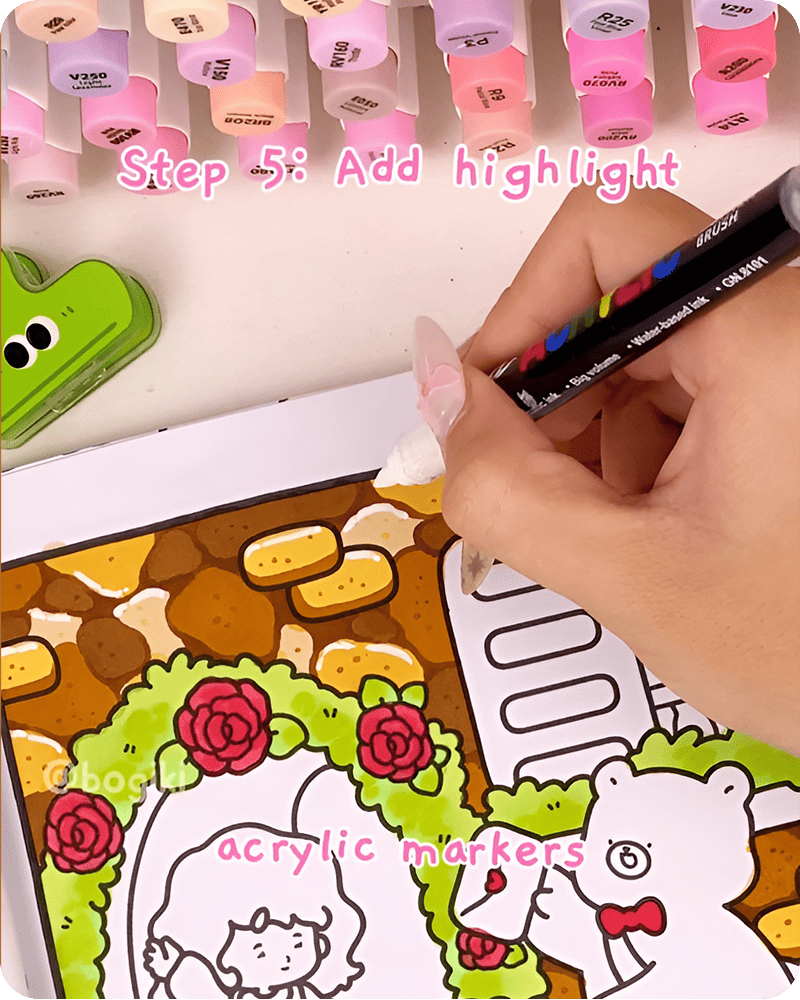
Next, take a yellow marker and add a few small dots across the wall. These tiny touches create a playful shimmer, helping your stone wall drawing feel more lively and warm.
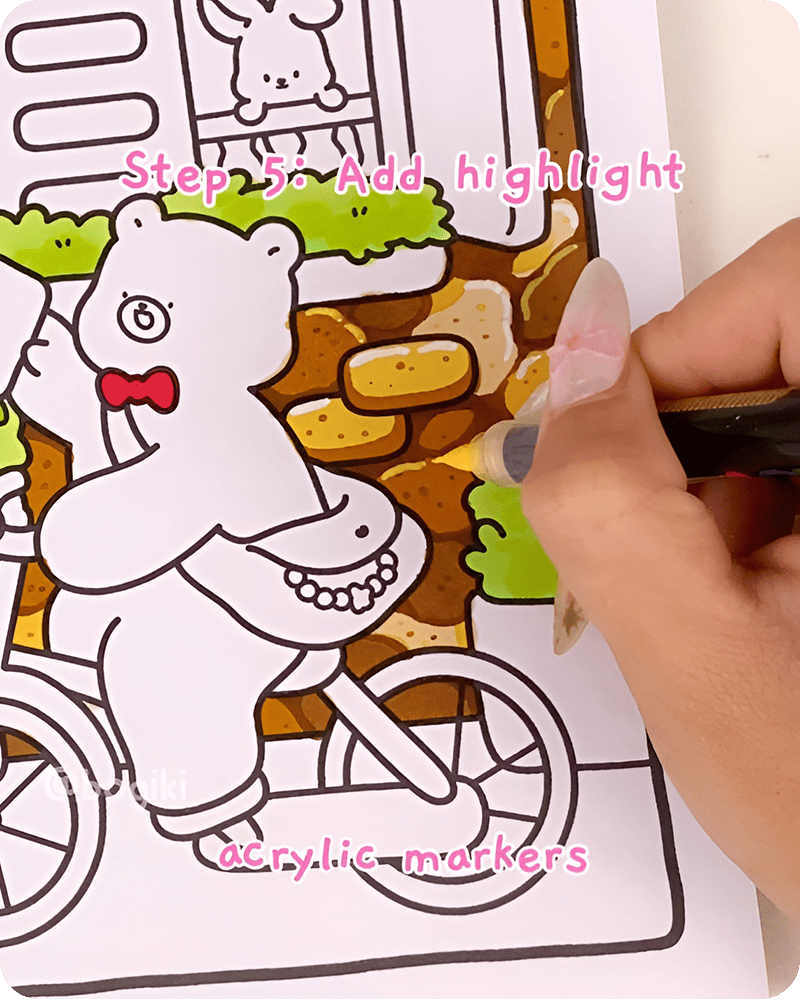
When learning how to draw a stone wall step by step, this step often feels the most magical. Small highlights can completely change how the drawing feels, even if they are barely noticeable at first glance.
For the final step of learning how to draw a stone wall step by step. Using soft green tones, begin adding small patches of moss and tiny plants along the edges and between the stones. These details do not need to be precise. In fact, the more organic they feel, the better.
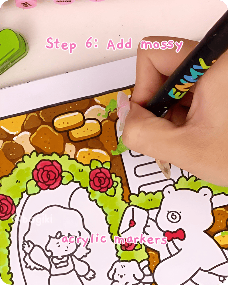
This final touch brings warmth and personality to your simple stone wall drawing, making it feel complete in a calm and natural way.
Sometimes, it feels easier to understand a drawing when you can simply watch it unfold. A video version lets you see how each color is placed, how the textures build up, and how small details are added without overthinking each step.
This can make practicing how to draw a stone wall step by step feel more intuitive. You are not just copying anymore, but gently learning the flow, allowing your own version to form at a pace that feels comfortable and unhurried.
When you finish learning how to draw a stone wall step by step, you might not need to move on right away. Let the drawing stay with you for a moment. Notice how the stones sit beside each other, how the colors feel soft and settled, and how everything comes together in a quiet, natural way.
From this small beginning, your drawing can slowly grow into something more. If you feel like continuing, you might enjoy exploring 4 cute wall drawing ideas. These gentle ideas can help you build around your stone wall, adding little scenes and details that make the whole page feel warmer and more personal.
This style is inspired by the Gentle Joys coloring book, where simple, everyday elements are turned into calm and comforting illustrations. You can explore the book in print or try a digital version, using it as a soft space to practice coloring, experiment with textures, and find your own rhythm.
There is no need to rush or overplan. Sometimes, starting with something as simple as a stone wall is enough to open up a quiet, cozy world you can return to whenever you like.
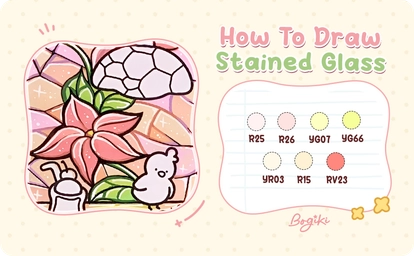
Learning how to draw a stained glass window easy can feel like opening a quiet little window into color, light, and gentle creativity. In this tutorial, you will explore a soft and relaxing way to build a stained glass drawing step by step using simple shapes, layered colors, and delicate highlights. The process is beginner-friendly, calm, and perfect for anyone who wants to enjoy drawing without pressure, letting each small detail slowly come together in its own beautiful way.
To begin learning how to draw a stained glass window easy, start by gently sketching your glass pieces using a colored pencil. Think of these shapes as small fragments of light, each one fitting together like a quiet puzzle.
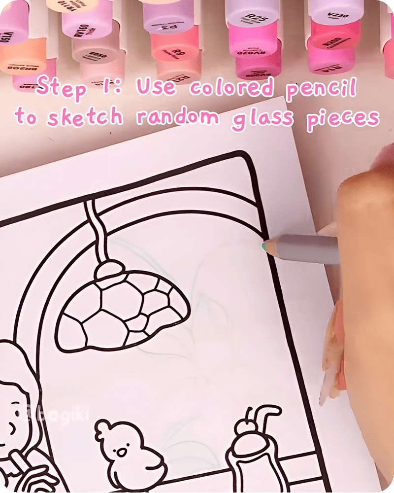
Now we slowly move into color, one of the most soothing parts of how to draw a stained glass window. Start with the floral areas. Use a soft beige marker R25 to lay down the first layer of color. Move lightly and leave a few spaces untouched so the drawing can breathe. Then, switch to a slightly deeper beige tone, R26, and gently layer over some areas. This creates a soft depth, making the flower feel more dimensional without being too bold.
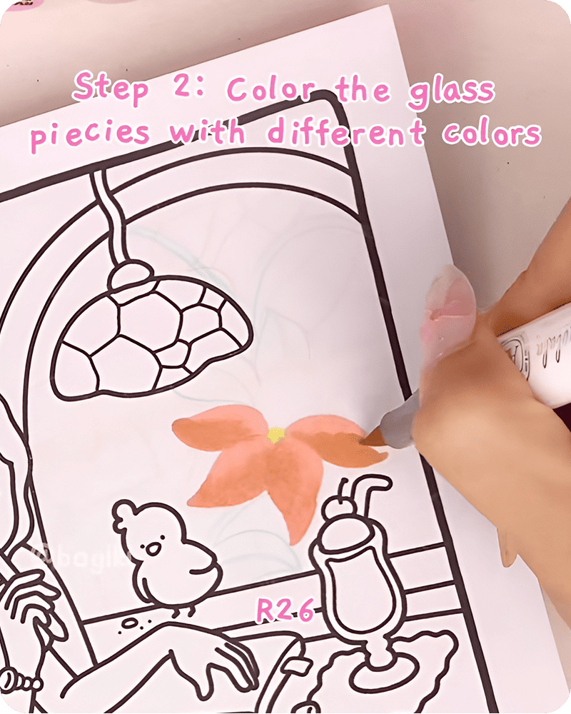
The next step in how to draw a stained glass window easy, bring in fresh green tones YG07 and YG66 for the leaves. Let the colors sit side by side instead of blending too much. This contrast helps each section stand out while still keeping a calm and balanced look.
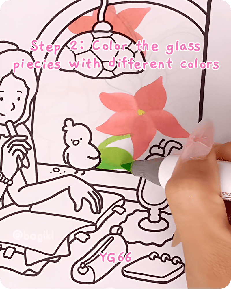
For the remaining glass areas, use a mix of warm beige tones like YR03 and R15. These soft shades help unify the drawing and give it a gentle warmth, which is often seen in simple stained glass drawing styles.
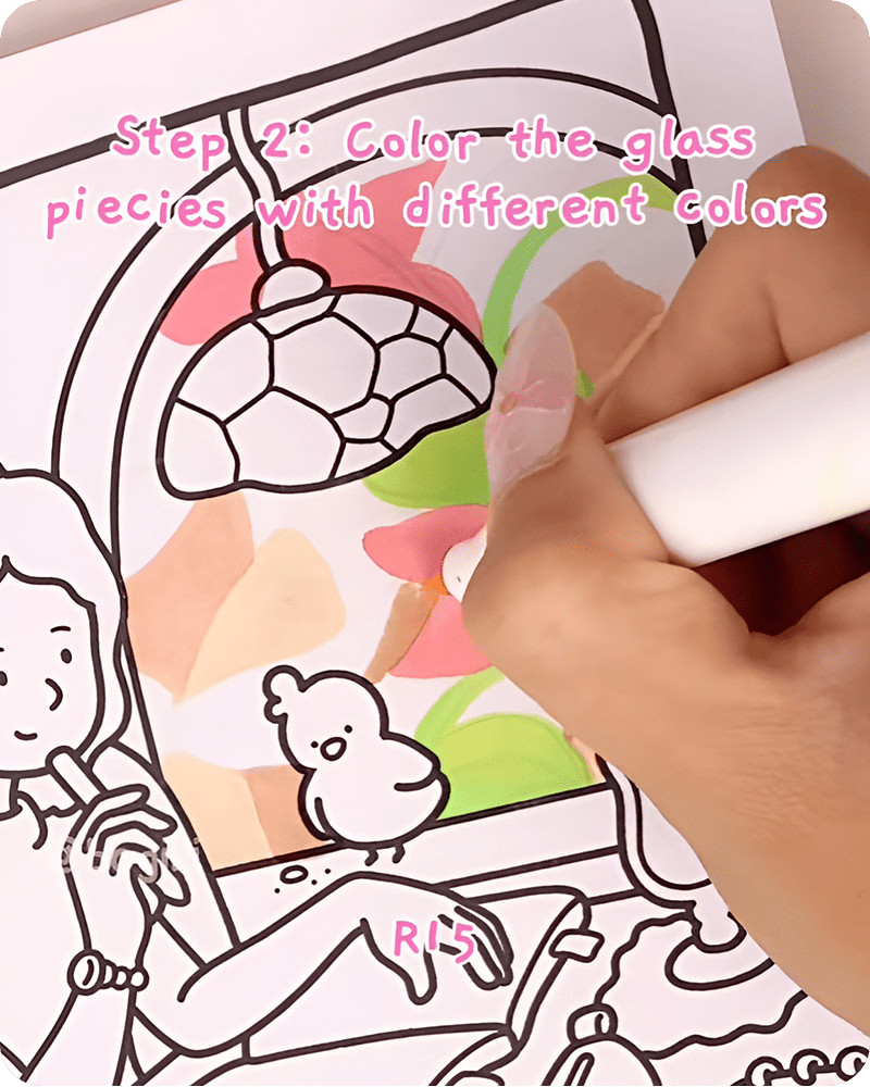
To add a playful touch, introduce small accents of pink RV23 and light brown YR03 between the beige sections. These subtle variations create a quiet rhythm of colors across the page.
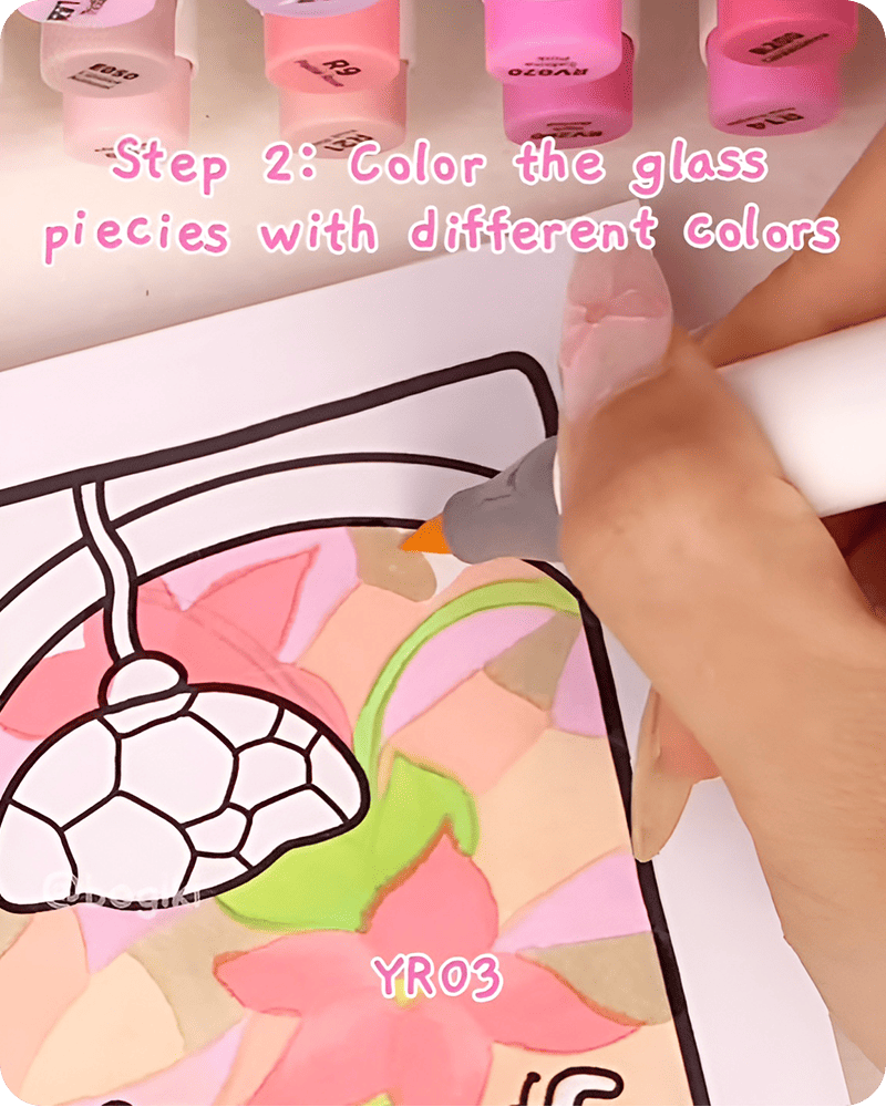
As you practice how to draw a stained glass window easy, you may find that layering colors slowly brings a peaceful flow to your drawing. Each small decision adds character, making your stained glass drawing ideas feel more personal and unique.
Once the colors feel complete, begin refining the shapes using an acrylic marker. Carefully trace over the lines of the floral patterns first, including the petals and leaves. You can also add a few extra details inside these shapes to make them stand out a little more.
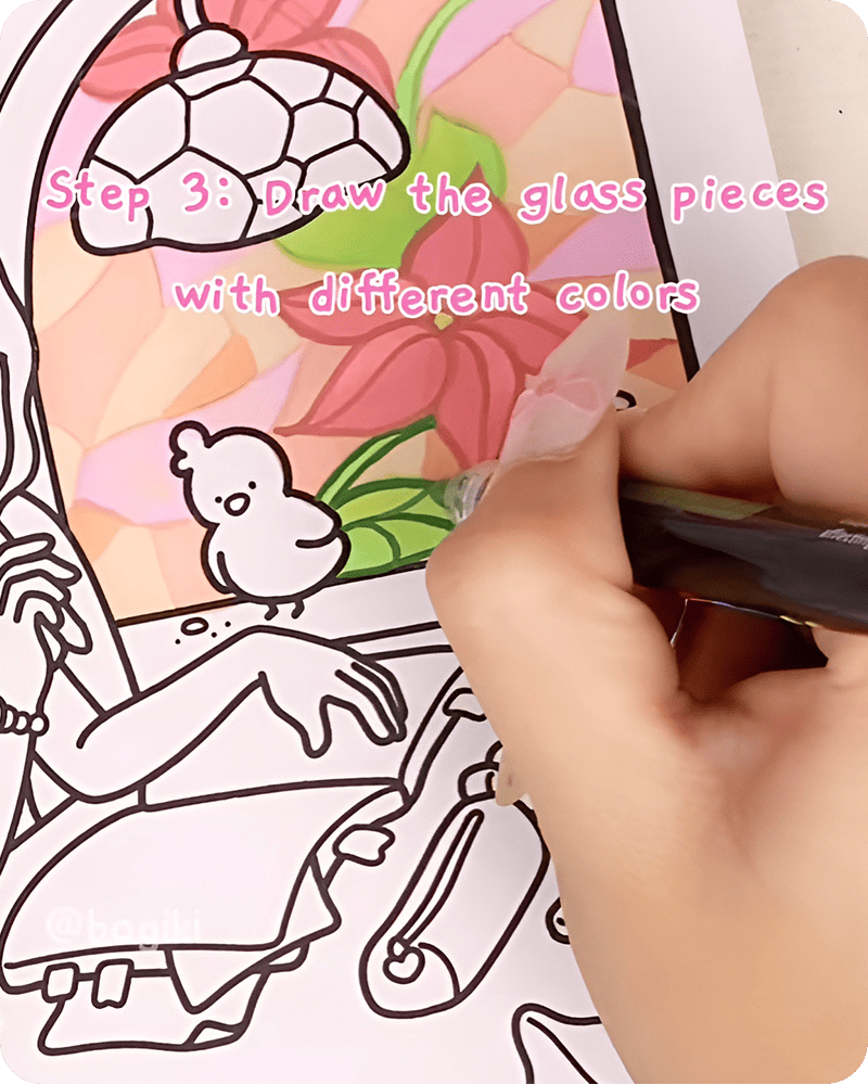
Then, move on to outlining each glass piece. These lines help separate the colors and give your stained glass window drawing a clearer structure.
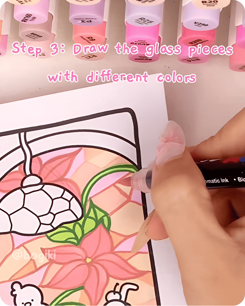
This stage of how to draw stained glass patterns is where everything begins to come together. The soft colors you added earlier now have definition, while the shapes feel more grounded and complete.
To bring a gentle glow into your stained glass drawing, use a white gel pen to outline selected edges of the glass pieces. You do not need to outline everything. Focus on areas where light might naturally reflect.
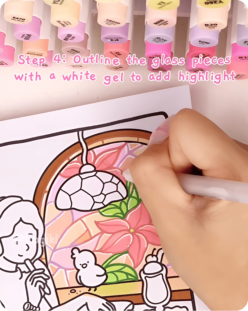
Draw soft lines along curves and edges, then add a few small dots across different sections. These tiny highlights create a subtle sparkling effect, similar to how light catches on real stained glass.
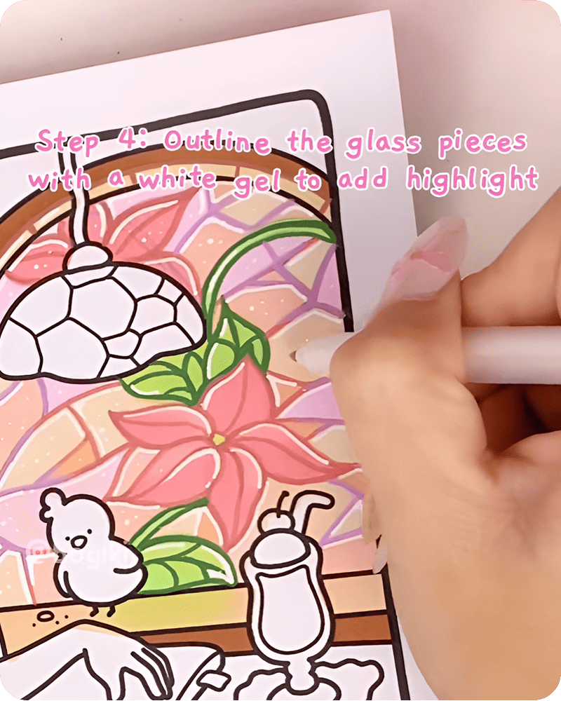
In many stained glass drawing tutorial approaches, this step is what adds a sense of magic. The drawing begins to feel brighter, softer, and slightly more alive.
Now take a black pen and carefully redraw the outlines of the glass pieces. Follow the shapes you created earlier, keeping your lines steady but not too heavy.
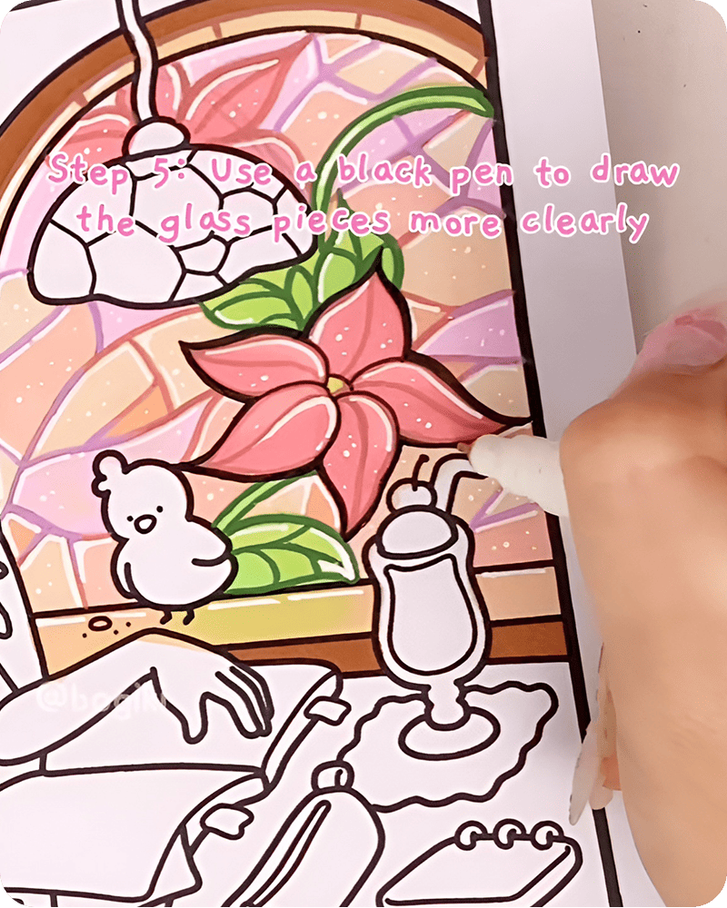
This step of how to draw a stained glass window easy helps clarify the structure of your simple stained glass window drawing. The contrast between the dark outlines and soft colors makes each section stand out while still preserving the cozy feeling of the piece.
For the final step of how to draw a stained glass window easy, return to your white gel pen and add a few extra highlights on top of the drawing. Place tiny dots and short lines in selected areas to enhance the sparkle effect. Keep it minimal and scattered so the result feels natural rather than overwhelming.
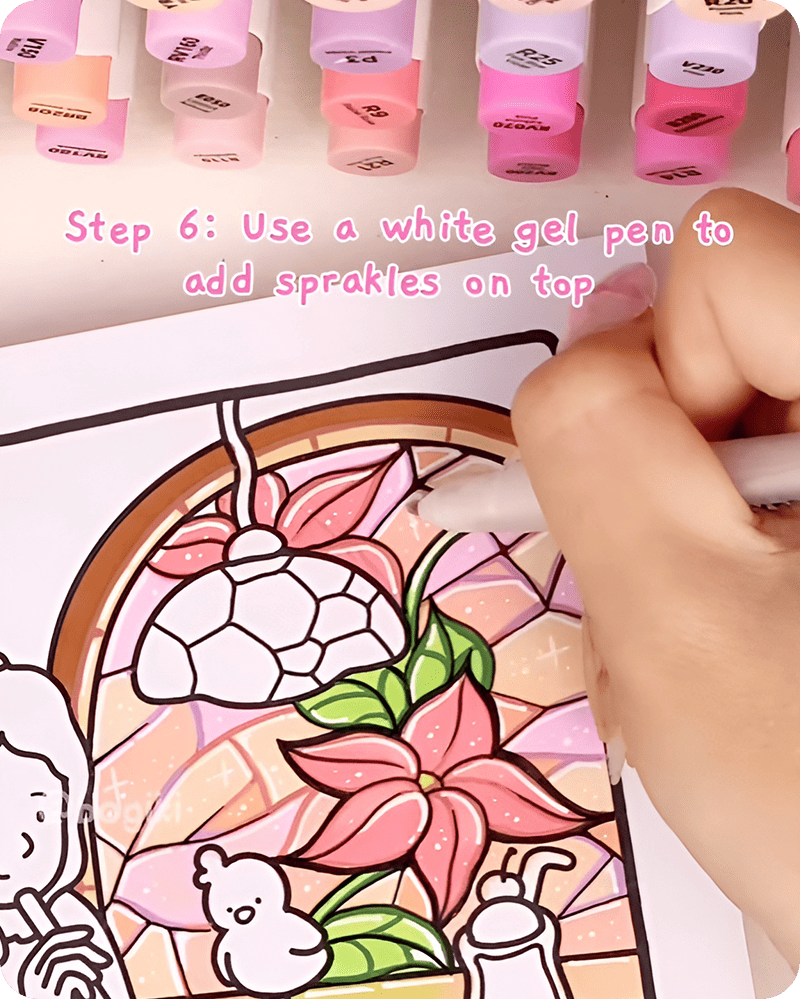
These last details act like soft reflections of light, bringing your stained glass easy drawing to a calm and finished state.
Watching the process of how to draw a stained glass window easy in motion brings a different kind of clarity to your drawing. Instead of imagining each step, you can quietly follow how the colors are placed, how the shapes are refined, and how the small details slowly come together across the page.
There is no need to rush. Pause whenever you like, replay certain moments, or simply watch the whole flow once before starting. Each way feels equally gentle and unpressured.
When you finish learning how to draw a stained glass window easy, let your drawing sit quietly for a moment. From here, you can begin to explore more playful directions. You might also enjoy trying 4 creative ways to draw windows with different moods and ideas. Instead of focusing only on stained glass, you can turn each window into its own little scene, adding landscapes, skies, or quiet everyday moments inside the frame. It becomes a simple way to bring storytelling into your drawings.
This style works especially well with cozy, scene-based illustrations. If you are exploring pages from the Girl Daily coloring book, you can gently apply these techniques to familiar settings, letting windows, patterns, and small details become more lively and expressive while still keeping the calm atmosphere.
Treat your inbox to a lovely surprise! Sign up now for exclusive content and special gifts

studio@bogiki.com
*Currently, we are unable to handle your call/voicemail/phone message. Please go to our Contact Form and leave an email.

